Skip to content

Dialogs

Dialogs are focused windows that interrupt the main flow to get input from the user or deliver important information. wxRuby3 provides ready-made dialogs for the most common tasks — file picking, colour selection, font selection, text entry, and messages — so you rarely need to build these from scratch.

This lesson covers the standard dialogs and then shows how to build your own when none of the built-in ones fit.

dialog_panel.png

Start fresh

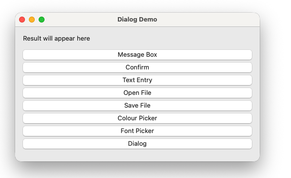
Create a new file called dialog_demo.rb:

 1
 2
 3
 4
 5
 6
 7
 8
 9
10
11
12
13
14
15
16
17
18
19
20
21
22
23
24
25
26
27
28
29
30
31
32
33
34
35
36
37
38
39
40
41
42
43
44
45
46
47
48
49
50
51
52
53
54
55
56
57
require 'wx'

class DialogFrame < Wx::Frame
  def initialize
    super(nil, title: 'Dialog Demo', size: [500, 400])

    build_ui
    bind_events

    layout
    centre
  end

  private

  def build_ui
    @panel = Wx::Panel.new(self)

    @result_label = Wx::StaticText.new(@panel, label: 'Result will appear here')

    # Buttons — one per dialog type
    @msg_btn      = Wx::Button.new(@panel, label: 'Message Box')
    @confirm_btn  = Wx::Button.new(@panel, label: 'Confirm')
    @text_btn     = Wx::Button.new(@panel, label: 'Text Entry')
    @file_open_btn = Wx::Button.new(@panel, label: 'Open File')
    @file_save_btn = Wx::Button.new(@panel, label: 'Save File')
    @colour_btn   = Wx::Button.new(@panel, label: 'Colour Picker')
    @font_btn     = Wx::Button.new(@panel, label: 'Font Picker')

    btn_sizer = Wx::VBoxSizer.new
    [@msg_btn, @confirm_btn, @text_btn,
     @file_open_btn, @file_save_btn,
     @colour_btn, @font_btn].each do |btn|
      btn_sizer.add(btn, 0, Wx::EXPAND | Wx::BOTTOM, 6)
    end

    outer = Wx::VBoxSizer.new
    outer.add(@result_label, 0, Wx::ALL, 16)
    outer.add(btn_sizer,     0, Wx::EXPAND | Wx::LEFT | Wx::RIGHT | Wx::BOTTOM, 16)
    @panel.set_sizer(outer)
  end

  def bind_events
    evt_close { |event| on_close(event) }
  end

  def on_close(event)
    event.skip
  end

  def show_result(text)
    @result_label.label = text
    @panel.layout
  end
end

Wx::App.run { DialogFrame.new.show }

Run it. Seven buttons, a result label at the top, and no dialog logic yet. We will add one dialog at a time.

Step 1 — Message box

Wx::message_box is the simplest dialog — it shows a message and one or more buttons. Add a handler in bind_events:

1
evt_button(@msg_btn.id) { on_message }
1
2
3
4
5
6
7
8
def on_message
  Wx::message_box(
    'This is a message dialog.',
    'Information',
    Wx::OK | Wx::ICON_INFORMATION
  )
  show_result('Message box dismissed')
end

Run it. Click Message Box — a native information dialog appears. The third argument combines a button flag with an icon flag using |. Common combinations:

Buttons Icon Use for
Wx::OK Wx::ICON_INFORMATION Informational messages
Wx::OK Wx::ICON_WARNING Non-critical warnings
Wx::OK Wx::ICON_ERROR Error messages
Wx::YES_NO Wx::ICON_QUESTION Confirmation prompts

Step 2 — Confirm dialog

A confirmation dialog returns which button the user pressed. Add a handler:

1
evt_button(@confirm_btn.id) { on_confirm }
 1
 2
 3
 4
 5
 6
 7
 8
 9
10
11
12
13
def on_confirm
  result = Wx::message_box(
    'Do you want to continue?',
    'Confirm',
    Wx::YES_NO | Wx::ICON_QUESTION
  )

  if result == Wx::YES
    show_result('User chose Yes')
  else
    show_result('User chose No')
  end
end

Run it. Wx::message_box returns the ID of the button pressed — Wx::YES, Wx::NO, Wx::OK, or Wx::CANCEL depending on which buttons you showed. This return value is how you branch on user decisions throughout the series — the save-on-exit prompt in Module 3 uses exactly this pattern.

Step 3 — Text entry dialog

Wx::TextEntryDialog asks the user to type something:

1
evt_button(@text_btn.id) { on_text_entry }
 1
 2
 3
 4
 5
 6
 7
 8
 9
10
11
12
13
14
15
16
def on_text_entry
  dialog = Wx::TextEntryDialog.new(
    self,
    'Enter your name:',
    'Text Entry',
    'Default value'
  )

  if dialog.show_modal == Wx::ID_OK
    show_result("Entered: #{dialog.value}")
  else
    show_result('Cancelled')
  end

  dialog.destroy
end

Run it. The show_modal call blocks until the user dismisses the dialog, then returns the ID of the button pressed — Wx::ID_OK or Wx::ID_CANCEL. Read the entered text with dialog.value.

Two things to notice that apply to every non-trivial dialog:

show_modal blocks. The event loop continues running (the app stays responsive) but your code pauses at show_modal until the dialog is dismissed. This is the correct behaviour for dialogs that require a decision before continuing.

dialog.destroy. wxRuby3 dialogs are not garbage collected automatically when they go out of scope. Always call destroy after you are done with a dialog’s data. Failing to do so leaks native window resources.

Step 4 — File dialogs

Wx::FileDialog handles both open and save. Add handlers for both buttons:

1
2
evt_button(@file_open_btn.id) { on_file_open }
evt_button(@file_save_btn.id) { on_file_save }
 1
 2
 3
 4
 5
 6
 7
 8
 9
10
11
12
13
14
15
16
17
18
19
20
21
22
23
24
25
26
27
28
29
30
31
32
33
34
35
36
37
def on_file_open
  dialog = Wx::FileDialog.new(
    self,
    'Open file',
    '',           # default directory — empty means last used
    '',           # default filename
    'Ruby files (*.rb)|*.rb|All files (*.*)|*.*',
    Wx::FD_OPEN | Wx::FD_FILE_MUST_EXIST
  )

  if dialog.show_modal == Wx::ID_OK
    show_result("Opening: #{dialog.path}")
  else
    show_result('Cancelled')
  end

  dialog.destroy
end

def on_file_save
  dialog = Wx::FileDialog.new(
    self,
    'Save file',
    '',
    'untitled.rb',
    'Ruby files (*.rb)|*.rb|All files (*.*)|*.*',
    Wx::FD_SAVE | Wx::FD_OVERWRITE_PROMPT
  )

  if dialog.show_modal == Wx::ID_OK
    show_result("Saving to: #{dialog.path}")
  else
    show_result('Cancelled')
  end

  dialog.destroy
end

Run both. The wildcard string 'Ruby files (*.rb)|*.rb|All files (*.*)|*.*' defines the file type filter — pairs of display name and pattern separated by |, multiple pairs separated by |. dialog.path returns the full path the user selected or entered.

Common flags:

Flag Effect
Wx::FD_OPEN Open mode
Wx::FD_SAVE Save mode
Wx::FD_FILE_MUST_EXIST Disables OK if file does not exist
Wx::FD_OVERWRITE_PROMPT Warns if the save file already exists
Wx::FD_MULTIPLE Allows selecting multiple files (open mode only)

Step 5 — Colour dialog

Wx::ColourDialog shows a native colour picker:

1
evt_button(@colour_btn.id) { on_colour }
 1
 2
 3
 4
 5
 6
 7
 8
 9
10
11
12
13
14
15
def on_colour
  data = Wx::ColourData.new
  data.colour = Wx::Colour.new(255, 0, 0)   # start with red selected

  dialog = Wx::ColourDialog.new(self, data)

  if dialog.show_modal == Wx::ID_OK
    colour = dialog.colour_data.colour
    show_result("Colour: R#{colour.red} G#{colour.green} B#{colour.blue}")
  else
    show_result('Cancelled')
  end

  dialog.destroy
end

Run it. Wx::ColourData carries the configuration into the dialog and the result back out. After the dialog closes, dialog.colour_data.colour returns a Wx::Colour object with red, green, and blue components.

Step 6 — Font dialog

Wx::FontDialog shows a native font picker:

1
evt_button(@font_btn.id) { on_font }
 1
 2
 3
 4
 5
 6
 7
 8
 9
10
11
12
13
14
15
16
17
def on_font
  data = Wx::FontData.new
  data.initial_font = @result_label.font

  dialog = Wx::FontDialog.new(self, data)

  if dialog.show_modal == Wx::ID_OK
    font = dialog.font_data.chosen_font
    @result_label.font = font
    show_result("Font: #{font.face_name} #{font.point_size}pt")
    @panel.layout
  else
    show_result('Cancelled')
  end

  dialog.destroy
end

Run it. The font picker opens with the result label’s current font pre-selected. Choose a different font and the label updates immediately — @result_label.font = font applies the chosen font directly to the widget.

Step 7 — Building a custom dialog

When none of the standard dialogs fits, subclass Wx::Dialog. A custom dialog is just a frame with a panel, sizer, and an OK/Cancel button pair — the same building blocks you already know.

Here is a simple login dialog:

dialog_2.png

 1
 2
 3
 4
 5
 6
 7
 8
 9
10
11
12
13
14
15
16
17
18
19
20
21
22
23
24
25
26
27
28
29
30
31
32
33
34
35
36
37
38
39
40
41
42
43
44
class LoginDialog < Wx::Dialog
  def initialize(parent)
    super(parent, title: 'Log In', style: Wx::DEFAULT_DIALOG_STYLE)

    panel = Wx::Panel.new(self)

    user_label = Wx::StaticText.new(panel, label: 'Username:')
    @user_field = Wx::TextCtrl.new(panel, value: '')

    pass_label = Wx::StaticText.new(panel, label: 'Password:')
    @pass_field = Wx::TextCtrl.new(panel, value: '', style: Wx::TE_PASSWORD)

    ok_btn     = Wx::Button.new(panel, id: Wx::ID_OK,     label: 'Log In')
    cancel_btn = Wx::Button.new(panel, id: Wx::ID_CANCEL, label: 'Cancel')
    ok_btn.set_default

    btn_row = Wx::HBoxSizer.new
    btn_row.add(cancel_btn, 0, Wx::RIGHT, 8)
    btn_row.add(ok_btn,     0)

    grid = Wx::FlexGridSizer.new(0, 2, 8, 12)
    grid.add_growable_col(1)
    grid.add(user_label,  0, Wx::ALIGN_CENTER_VERTICAL)
    grid.add(@user_field, 1, Wx::EXPAND)
    grid.add(pass_label,  0, Wx::ALIGN_CENTER_VERTICAL)
    grid.add(@pass_field, 1, Wx::EXPAND)

    outer = Wx::VBoxSizer.new
    outer.add(grid,    0, Wx::EXPAND | Wx::ALL, 16)
    outer.add(btn_row, 0, Wx::ALIGN_RIGHT | Wx::RIGHT | Wx::BOTTOM, 16)
    panel.set_sizer(outer)

    fit
    centre
  end

  def username
    @user_field.value
  end

  def password
    @pass_field.value
  end
end

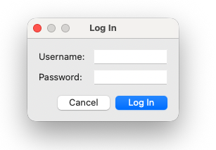
Add this class to dialog_demo.rb above the DialogFrame class — it needs to be defined before DialogFrame references it.

In a real multi-file app, custom dialogs would live in their own files under lib/dialogs/ and be pulled in with require_relative — exactly the file structure covered in Module 3. For now, same file, above the frame class.

Two things make this work as a modal dialog without any extra wiring:

Stock button IDs. Using Wx::ID_OK and Wx::ID_CANCEL for the buttons gives wxRuby3 enough information to handle show_modal’s return value automatically. When the user clicks OK, show_modal returns Wx::ID_OK. When they click Cancel or close the dialog, it returns Wx::ID_CANCEL. No evt_button handlers needed.

fit. Called at the end of initialize, fit resizes the dialog to exactly wrap its contents. Unlike a frame where you specify size:, dialogs should size themselves from their content.

Use the login dialog from the frame:

 1
 2
 3
 4
 5
 6
 7
 8
 9
10
11
def on_login
  dialog = LoginDialog.new(self)

  if dialog.show_modal == Wx::ID_OK
    show_result("Login: #{dialog.username} / #{'*' * dialog.password.length}")
  else
    show_result('Login cancelled')
  end

  dialog.destroy
end

Add a button for it and wire it up to see it in action.


Previous: Menus and toolbars | Next: Preferences panel