Module 03 — Formatters and color palettes
What We’re Building
The GDP chart from Module 02 works — but it is hard to read. The Y axis shows raw
numbers like 1,000 and 7,000 with no indication of what they represent. The tooltip
shows 30.9 with no unit. A reader cannot tell whether they are looking at dollars,
tonnes, or index points.
This module solves that problem with a formatter system that keeps all JavaScript out of Ruby while giving you full control over how values are displayed across axes, tooltips, and labels.
By the end you will have:
- Simple string templates for standard unit types (kg, km, °C, etc. )
- Pre-built named formatters covering the most common parameter based formatting needs
- Extension system for your own custom formatters.
In this module we also provide:
- Simple example charts demonstrating formatter combinations
- The updated GDP chart with proper currency formatting
- A clear understanding of when to use string templates vs named formatters
- An extensible palette library for customising the chart data colors.
Here’s what our final example looks like (again, without any javascript):
3.1 — Background - Why Formatters Are a JavaScript Problem
ECharts formatters are JavaScript functions. A Y axis formatter that displays billions as currency looks like this in JavaScript:
|
|
This cannot be serialised to JSON — JSON has no function type. When chart_controller.js
receives the options hash via the Stimulus value system, it uses JSON.parse, which
would mangle any attempt to embed a raw JavaScript function string.
The solution is a named formatter registry. Ruby passes a string name:
|
|
chart_controller.js resolves the name to a function before calling setOption.
ECharts receives a real JavaScript function. Ruby never touches JavaScript.
String templates — "{value}kg", "{value}°C" — are different. They are valid JSON
strings that ECharts interprets natively on the JavaScript side. No resolution needed.
Both approaches coexist transparently.
3.2 — The Solution
All formatting logic lives in two files:
app/javascript/
  charts/
    chart_formatters.js         ← base library, shipped with the application
    custom_chart_formatters.js  ← application-specific formatters, user-owned
Custom formatters override base formatters when names clash — so you can replace any base formatter if the standard implementation does not suit your application.
Pin both files in config/importmap.rb:
|
|
chart_controller.js imports the merged registry:
|
|
3.3 — String Templates
For simple units that require no calculation, use ECharts string templates directly.
No formatter registry entry needed — the string passes through the JSON pipeline
unchanged and ECharts substitutes {value} with the axis tick value.
|
|
String templates are the right choice whenever the value requires no arithmetic — just a prefix, suffix, or both. The moment you need rounding, scaling, conditional logic, or multi-series tooltip content, reach for a named formatter instead.
3.4 — Named Formatters
If a formatter string contains {value}, it is a string template — ECharts handles it natively and the resolver leaves it untouched. If it does not contain {value}, the resolver looks it up in the named formatter list. If found, it is replaced with a function. If not found, it is passed through as-is and ECharts will likely ignore it. The practical rule: templates contain {value}, named formatters do not.
|
|
Base formatter reference
| Name | Output example | Use when |
|---|---|---|
"integer" |
1,234 |
Plain integers with thousands separator |
"percent" |
42% |
Whole number percentages |
"rate" |
3.5% |
Decimal percentages |
"billions" |
$42B |
Values already expressed in billions |
"millions" |
$1,234M |
Values already expressed in millions |
"thousands" |
3,842k |
Values already expressed in thousands |
"currency" |
$42.3B / $1.2T |
Auto-scales millions → billions → trillions |
Formatting examples (axes only):
Whenever we create new charts, you’ll need to add the routes and update the index page. Here’s what is needed for these examples (in future examples we’ll leave it to you to add to the routes and index)
|
|
Gallery cards to add to app/views/charts/index.html.erb
|
|
Example 1: simple bar chart with currency Y axis
Add these examples to our demo app:
|
|
<%# app/views/charts/formatter_currency.html.erb %>
<h1 class="text-2xl font-bold mb-6">Currency Axis Formatter</h1>
<%= render Components::Charts::FormatterCurrency.new(data: @data) %>
|
|
The Y axis now shows $18.7B, $46.3B etc. — no JavaScript in sight.
Example 2: percentage Y axis
|
|
<%# app/views/charts/formatter_percent.html.erb %>
<h1 class="text-2xl font-bold mb-6">Currency Axis Formatter</h1>
<%= render Components::Charts::FormatterCurrency.new(data: @data) %>
|
|
Example 3: string template for plain units
|
|
<%# app/views/charts/formatter_units.html.erb %>
<h1 class="text-2xl font-bold mb-6">String Template Formatter</h1>
<%= render Components::Charts::FormatterUnits.new(data: @data) %>
|
|
3.5 — Named Formatters: Tooltips
Tooltip formatters receive different input depending on trigger. With trigger: “axis” — used for line and bar charts — the formatter receives an array of all series values at the hovered x position. With trigger: “item” — used for pie and scatter charts — it receives a single object for the specific hovered data point.
All axis tooltip formatters in the base library produce a right-aligned table — series name on the left, formatted value on the right. This is the correct semantic structure for tabular data and produces reliable alignment across browsers.
Axis trigger — params array properties
| Property | Value |
|---|---|
params[n].marker |
Coloured series dot (HTML string) |
params[n].seriesName |
Series name |
params[n].value |
Data value |
params[0].axisValueLabel |
X-axis label at the hovered position |
Item trigger — single params properties
| Property | Value |
|---|---|
params.marker |
Coloured dot |
params.name |
Data point name |
params.value |
Data value |
params.percent |
Percentage (pie/donut charts only) |
Axis tooltip formatter reference
| Name | Use when |
|---|---|
"default" |
Plain numbers, no unit |
"billions" |
Values in billions, currency |
"currency" |
Auto-scaling currency (millions/billions/trillions) |
"percent" |
Percentage values |
"thousands" |
Values in thousands (employment figures etc.) |
Item tooltip formatter reference
| Name | Use when |
|---|---|
"default" |
Scatter, single-series — plain value |
"percent" |
Pie/donut — shows percentage |
Example: bar chart with matching axis and tooltip formatters
|
|
Both formatters use the same auto-scaling logic. When the Y axis shows $42.3B,
the tooltip shows $42.3B — not 42.3 or $42,300M.
Axis and tooltip formatters must agree on units and scale. A chart where the Y axis
shows $42.3B but the tooltip shows 42300 is confusing. Always pair them:
3.6 — Updating the GDP Chart
Apply formatters to the Module 02 GDP chart. The component changes are minimal:
|
|
Two lines changed — formatter: "currency" on the tooltip,
axisLabel: { formatter: "currency" } on the Y axis. The chart now reads clearly
without any JavaScript in the component.
3.7 — Custom Formatters
Add application-specific formatters to custom_chart_formatters.js. They are
immediately available by name from any Ruby component — no other configuration needed.
|
|
Reference by name from Ruby:
|
|
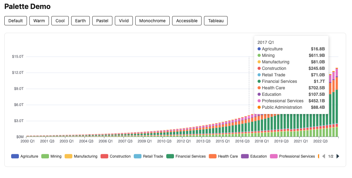
3.8 — Colour Palettes
ECharts assigns colours to series in order from the color array. By default it uses
its own built-in palette. We replace that with a named palette registry — the same
two-file pattern as formatters.
Setup
Add two files alongside the formatter files:
app/javascript/charts/
  chart_palettes.js         ← base palette library
  custom_chart_palettes.js  ← application-specific palettes
Add importmap pins:
|
|
Usage
Pass a palette name via the color: key in Chart::Options:
|
|
chart_controller.js resolves the name to a colour array before calling setOption.
If the name is not found in the registry, the value is left unchanged.
Available Palettes
| Name | Character |
|---|---|
"default" |
ECharts’ own palette — familiar and well-balanced |
"warm" |
Reds, oranges, yellows — energy and urgency |
"cool" |
Blues, greens, purples — calm and professional |
"earth" |
Browns, tans, sage — natural and grounded |
"pastel" |
Soft muted tones — gentle, good for reports |
"vivid" |
High saturation — bold, presentation-ready |
"monochrome" |
Single blue hue — print-friendly |
"accessible" |
Okabe-Ito — optimised for colour-blind users |
"tableau" |
Tableau-inspired — perceptually well-tuned |
Each palette contains 12 entries. If a chart has more series than palette entries, ECharts cycles back to the first colour automatically. If you genuinely need more than 12 distinct colours, that’s the time to consider creating a custom palette.
The accessible palette is based on the Okabe-Ito set, designed to be distinguishable
across the most common forms of colour vision deficiency. Use it for any public-facing
work where accessibility is a requirement.
Consistency Across Charts
If two charts on the same page use the same palette and their series are in the same order — which they will be if driven by the same service call — the colours will correspond automatically. No extra configuration needed.
|
|
This becomes particularly important in Module 11 — Linked Charts, where clicking a column in one chart drills down to a related chart on the same page.
Custom Palettes
Add application-specific palettes to custom_chart_palettes.js:
|
|
Then reference by name from Ruby:
|
|
Try It
Revisit the formatter example charts from earlier in this module and experiment with
different palettes. Try "warm" on the currency bar chart, "cool" on the percentage
line chart, and "accessible" on the GDP multi-series chart. Notice how the same
palette applied to two charts on the same page keeps series colours consistent.
3.9 — Rich Text Labels
ECharts supports multi-line, mixed-style labels using a rich object — named text
styles referenced in formatter strings like "{bold|Mining}: {value|$42B}". This is
powerful enough for its own module and is covered separately in Module X — Advanced
Label Formatting.
3.10 — How the Resolver Works
This section explains the internals of formatter resolution. It is not essential to use the system — if you are comfortable with the pattern, skip ahead.
The problem
The Stimulus value system uses JSON.parse to convert the data-chart-options-value
attribute into a JavaScript object. JSON does not support functions. A formatter string
like "function(v){ return '$' + v + 'B' }" survives JSON serialisation as a string —
but ECharts receives a string, not a function, and ignores it.
The solution
chart_controller.js walks the options object after JSON parsing, before calling
setOption. Any string value attached to a key named "formatter" is looked up in
the registry. If a match is found, the string is replaced with the actual function:
|
|
The resolver is called in two places in chart_controller.js:
|
|
What the resolver covers
Because it walks the entire option tree recursively, named formatters work in every
ECharts context that accepts a formatter key:
tooltip.formatterxAxis.axisLabel.formatteryAxis.axisLabel.formatterseries[n].label.formattermarkLine.label.formattervisualMap.formatter
No per-chart or per-context configuration is needed.
String templates pass through unchanged
If a formatter string does not match any registry key, the resolver leaves it
untouched. ECharts receives it as a string and applies its native template
substitution. This is how "{value}kg" and "{value}°C" work — they are never
in the registry and are never touched by the resolver.
Parse safety
Axis label values may arrive as pre-formatted strings ("1,000" rather than 1000)
depending on ECharts internals and the data type. The base formatters use a parse
helper that strips commas before parsing:
|
|
This ensures currency("1,000") correctly evaluates 1000 >= 1 and returns $1.0B
rather than NaN.
3.11 — Module Summary
The formatter decision tree:
Does the formatter require arithmetic, rounding, or conditional logic?
  No  → Use a string template: axisLabel: { formatter: "{value}kg" }
  Yes → Does a base formatter cover it?
    Yes → Use the named formatter: axisLabel: { formatter: "currency" }
    No  → Add a custom formatter to custom_chart_formatters.js
Files introduced in this module:
| File | Purpose |
|---|---|
app/javascript/charts/chart_formatters.js |
Base formatter registry |
app/javascript/charts/custom_chart_formatters.js |
Application-specific formatters |
Importmap pins to add:
|
|
Pairing reference:
| Axis label | Tooltip |
|---|---|
"currency" |
"axisCurrency" |
"billions" |
"axisBillions" |
"rate" |
"axisPercent" |
"thousands" |
"axisThousands" |
"{value}%" |
"axisPercent" |
Next: Module 04 — Line and Area Charts: GDP Trends