Module 01 — Foundation: Your First Chart
Before You Start
This tutorial series assumes familiarity with Phlex and the Literal gem. If you haven’t used them before, work through the Phlex v2 on Rails series first, or visit Phlex Home and read the section on Literal Properties.
The tutorial repo contains a pre-configured Rails 8 application with the chart library already installed. Unzip it, run the database setup, and you’re ready:
|
|
Always use
bin/dev, notbin/rails server.bin/devruns both the Rails server and the Tailwind CSS watcher. Without it, new Tailwind classes won’t compile and the page will be unstyled.
Here’s what we’ll be building:
1.1 — The Component
The component is the heart of this library. Everything you build in this series starts here. Let’s look at one in full before explaining each part:
|
|
What the component does
The component inherits from Components::Chart — the base class that handles
rendering. Its one job is to implement chart_options, returning a
Chart::Options object that describes the chart.
Chart::Options is Ruby code that maps directly to ECharts’ JavaScript
configuration. To understand the relationship, here is the equivalent raw
JavaScript you would write without this library:
|
|
The Ruby and JavaScript structures are identical in shape. The differences:
- Snake_case to camelCase — you write
x_axis:, the library converts it toxAxisin the JSON. You writey_axis:, it becomesyAxis. Ruby convention, ECharts format — no mental switching. - Series type — you write
::Chart::Series::Line.new(...), the library addstype: "line"automatically. No boilerplate. - No JavaScript — the entire chart configuration is Ruby. Testable, readable, reusable.
Applying defaults
Components::Chart provides sensible defaults through its props:
|
|
When you render the component without specifying height:, it defaults to
400px. When you don’t specify color:, ECharts uses its own default palette.
You only specify what you want to change — everything else just works.
:group, :color and :select_url are placeholders at this stage for some of
the functionality we will gain in upcoming chapters.
Why not just write JavaScript?
Three reasons:
Testability — chart_options returns a plain Ruby hash. You can test it
without a browser, without JavaScript, without Rails. A unit test can call
component.send(:chart_options).to_h and assert on the result directly.
Reusability — a component is a Ruby class. It takes data: and renders
a chart. Render it from any controller action, any view, any context — with
different data each time.
One pattern — once you understand how one chart component works, you understand all of them. Every chart in this series follows the same structure.
1.2 — The Data
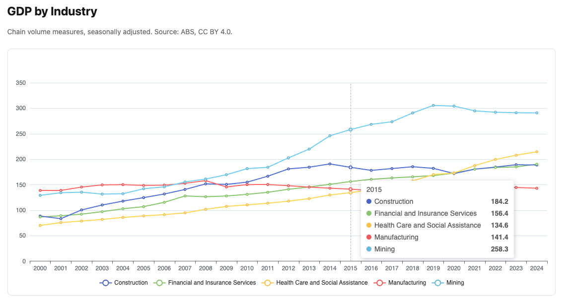
This tutorial uses real data from the Australian Bureau of Statistics — GDP by industry, quarterly, from 2000 to 2024.
For our first chart we show five industries that together tell the story of structural change in the Australian economy:
| Industry | Story |
|---|---|
| Mining | Dominant and volatile — the resources boom is clearly visible |
| Construction | Steady growth with a post-2020 housing boom |
| Financial and Insurance Services | Large and stable — GFC dip visible |
| Health Care and Social Assistance | Consistent growth, now one of the largest sectors |
| Manufacturing | Long decline — structural change away from goods production |
We aggregate quarterly data to annual totals — one value per year, 25 years, a clean simple x axis. Quarterly detail is available in later modules.
1.3 — The Service
The service transforms raw ActiveRecord data into a plain Ruby hash the component can use. It has one job — data transformation — and knows nothing about charts:
|
|
What each step does:
select filters to our five industries. group_by(&:industry) groups all
readings by industry name, producing a hash of arrays. transform_values
maps over each industry’s readings. Inside: group_by(&:year) groups by year,
.sort ensures chronological order, .map sums the four quarters for each
year and rounds to one decimal place.
The result is a hash where each key is an industry name and each value is an
array of 25 annual totals — exactly the shape build_series in the component
expects.
Why a separate service?
The same data could feed a CSV export, an API response, or a different chart type. The service doesn’t know or care — it just transforms data. This principle applies throughout the series.
1.4 — The Plumbing
The controller, route, and view are standard Rails. You’ll see this same pattern in every module — it won’t be explained again in detail.
|
|
|
|
<%# app/views/charts/gdp_by_industry.html.erb %>
<h1 class="text-2xl font-bold mb-2">GDP by Industry</h1>
<p class="text-neutral-500 text-sm mb-6">
  Annual chain volume measures, five key industries, 2000–2024.
  Source: ABS National Accounts, CC BY 4.0.
</p>
<%= render Components::Charts::GdpByIndustry.new(
  data:   @data,
  height: "460px"
) %>
The controller calls the service and passes the result to the view. The view
renders the component with the data. The component builds the chart options.
chart_controller.js takes it from there — resolving palette names, formatter
names, and calling ECharts setOption.
1.5 — The Gallery
The gallery is a simple index page that links to each chart as you build them. Create it once — you’ll add cards throughout the series.
|
|
|
|
<%# app/views/charts/index.html.erb %>
<div class="max-w-5xl mx-auto px-4 py-8">
  <h1 class="text-3xl font-bold mb-2">Chart Gallery</h1>
  <p class="text-neutral-500 text-sm mb-8">
    Built with Phlex, ECharts, and real ABS data.
  </p>
  <div class="grid grid-cols-2 gap-4">
    <%= render "charts/gallery_card",
      title:       "GDP by Industry",
      description: "Annual GDP — Mining, Construction, Finance, Health, Manufacturing.",
      path:        charts_gdp_by_industry_path %>
  </div>
</div>
<%# app/views/charts/_gallery_card.html.erb %>
<div class="border border-neutral-200 rounded-lg p-4
hover:border-neutral-400 transition-colors">
<%= link_to path, class: "block" do %>
<h2 class="font-semibold mb-1"><%= title %></h2>
<p class="text-sm text-neutral-500"><%= description %></p>
<% end %>
</div>1.6 — What You Should See
Visit /charts/gdp_by_industry. You should see:
- Five coloured lines on a single chart
- Years 2000–2024 on the x axis
- GDP in billions on the y axis
- A legend at the bottom — click any industry to hide or show its line
- A tooltip on hover showing all five values for that year
The stories in the data:
Mining rises sharply through the 2000s resources boom, peaks around 2011–2013, then falls back. Health Care grows steadily and is now larger than Manufacturing, which has declined consistently. Construction shows a clear post-2020 acceleration. Financial Services dipped during the GFC (2008–2009) but recovered quickly.
This is real data. These are real economic shifts. The tooltip makes them precisely readable.
1.7 — Troubleshooting
Chart container visible but empty:
- Open the browser console — look for JavaScript errors
- Confirm
bin/devis running, not justbin/rails server - Check the mount div has an explicit height in the rendered HTML
undefined method 'chart_options':
- The component must implement
chart_optionsas aprivatemethod - Check the class inherits from
Components::Chart
No data — blank chart with axes but no lines:
- Run
rails runner "puts GdpReading.count"— should be 1900 - If zero, run
rails db:seed
1.8 — Summary
What we built:
| Layer | File | Responsibility |
|---|---|---|
| Service | stats/gdp_by_industry.rb |
Filter 5 industries, aggregate to annual totals |
| Component | charts/gdp_by_industry.rb |
Build Chart::Options, render the mount div |
| Controller | charts_controller.rb |
Call service, pass data to view |
| View | gdp_by_industry.html.erb |
Render the component |
The pattern — repeated in every module:
controller → service → @data → view → component → Chart::Options → chart_controller.js → EChartsKey ideas introduced:
Chart::Optionsmaps Ruby to ECharts configuration — same structure, Ruby syntax- Snake_case keys (
x_axis:) convert to camelCase (xAxis) automatically Chart::Series::Lineaddstype: "line"— no boilerplate- The service is chart-agnostic — it transforms data, nothing more
- The component is testable in plain Ruby — no browser required
Components::Chartprovides defaults — only specify what you want to change
Next: Module 02 — Formatters and Colour Palettes