Lesson 09 — Advanced Label Formatting
What We’re Building
ECharts has a sophisticated label system that goes well beyond simple value display. This module covers the techniques that make charts genuinely informative rather than merely decorative — rich text labels, annotations, reference lines, shaded regions, and conditional label display.
We use two datasets throughout:
- GDP by Industry — for rich text labels on bar charts
- National Accounts — for
markLineandmarkAreaannotations on line charts
By the end of this module you will have:
- Rich text labels with styled segments, colours, and backgrounds
markLine— threshold lines, average lines, custom annotationsmarkArea— shaded regions highlighting significant periods- Label positioning and overlap avoidance
- Conditional labels using
markPoint
Here’s what it will look like:
9.1 — Rich Text Labels
ECharts labels normally display a single formatted value. The rich property
allows a label to contain multiple styled text segments — different fonts, sizes,
colours, and backgrounds within one label.
The rich property
|
|
The formatter string uses {styleName|text} syntax. Each named style in rich
applies to its segment. ECharts template variables {b}, {c}, {d} work
inside rich segments.
The service
|
|
The component
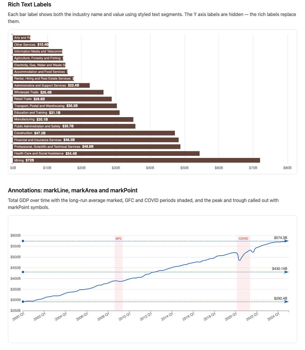
A horizontal bar chart where each bar label shows the industry name and value — the axis labels are hidden because the rich labels replace them:
|
|
axisLabel: { show: false } hides the default Y axis labels — the rich labels
inside the bars replace them entirely. position: "insideLeft" places the label
at the left edge of each bar, inside the fill.
9.2 — markLine
markLine adds reference lines to a series. Lines can be at a statistical value
(average, min, max), a fixed value, or between two points.
markLine data formats
|
|
The service
|
|
The component
A GDP trend line with average, GFC low, and recent peak marked:
|
|
axisLabel: { interval: 7, rotate: 30 } — shows every 8th label (one per year
for quarterly data) rotated 30 degrees to prevent overlap.
{ b } in the markLine label formatter refers to the line’s name. {c} is
the value at that line.
9.3 — markArea
markArea shades a region of the chart — useful for highlighting significant
periods like the GFC, the COVID disruption, or policy change windows.
|
|
Each entry in data is a pair — start and end coordinates. Multiple areas can
be defined in one markArea. The label on the first coordinate of each pair
becomes the area label.
Combined markLine and markArea
Add both to the GDP trend component:
|
|
9.4 — Label Positioning
Position values
| Position | Description |
|---|---|
"top" |
Above the data point |
"bottom" |
Below the data point |
"inside" |
Centred within the bar |
"insideLeft" |
Left edge, inside |
"insideRight" |
Right edge, inside |
"insideTop" |
Top edge, inside |
"outside" |
Outside the shape (pie/donut) |
Avoiding label overlap
For dense charts, labelLayout hides overlapping labels automatically:
|
|
ECharts keeps the most significant labels visible and hides those that would collide — no manual calculation needed.
markPoint — labelling significant data points
Rather than labelling every data point, markPoint places a symbol at the min
and max only:
|
|
type: "max" and type: "min" find the extremes automatically. Combine with
markLine and markArea for a fully annotated chart.
9.5 — The Showcase Page
|
|
|
|
<%# app/views/charts/label_formatting.html.erb %>
<div class="max-w-5xl mx-auto px-4 py-8">

  <h1 class="text-3xl font-bold mb-2">Advanced Label Formatting</h1>
  <p class="text-neutral-500 text-sm mb-8">
    Source: ABS GDP by Industry and National Accounts, CC BY 4.0.
  </p>

  <h2 class="text-xl font-semibold mb-2">Rich Text Labels</h2>
  <p class="text-neutral-600 mb-4">
    Each bar label shows both the industry name and value using styled text
    segments. The Y axis labels are hidden — the rich labels replace them.
  </p>
  <%= render Components::Charts::GdpRichLabels.new(
    data:   @gdp_bars,
    height: "480px"
  ) %>

  <h2 class="text-xl font-semibold mt-10 mb-2">
    Annotations: markLine, markArea and markPoint
  </h2>
  <p class="text-neutral-600 mb-4">
    Total GDP over time with the long-run average marked, GFC and COVID
    periods shaded, and the peak and trough called out with markPoint symbols.
  </p>
  <%= render Components::Charts::GdpTrend.new(
    data:   @gdp_trend,
    height: "420px"
  ) %>

  <div class="border-t border-neutral-200 pt-6 mt-8">
    <p class="text-neutral-400 text-xs">
      Data: Australian Bureau of Statistics. CC BY 4.0.
    </p>
  </div>

</div>
9.6 — Gallery
<%= render "charts/gallery_card",
  title:       "Advanced Label Formatting",
  description: "Rich text labels, markLine, markArea, markPoint, "\
               "and label overlap avoidance.",
  path:        charts_label_formatting_path %>
9.7 — Module Summary
New files:
| File | Purpose |
|---|---|
app/services/stats/gdp_latest_quarter.rb |
Latest quarter GDP by industry |
app/services/stats/gdp_trend.rb |
GDP total over time |
app/views/components/charts/gdp_rich_labels.rb |
Rich text label bar chart |
app/views/components/charts/gdp_trend.rb |
Annotated trend line |
Patterns introduced:
- Rich text labels —
richproperty,{styleName|text}formatter syntax markLine— average, min/max, and fixed value reference linesmarkArea— shaded regions with labels for significant periods- Combined
markLine+markArea+markPoint— layered annotations markPoint— symbols at min/max data pointslabelLayout: { hideOverlap: true }— automatic overlap avoidanceaxisLabel: { interval: N, rotate: N }— label density on category axes
Rich text formatter syntax:
"{styleName|content}"   — styled segment
"{b}"                   — data name (series or bar label)
"{c}"                   — data value
"{d}"                   — percentage (pie charts)
"\n"                    — line break within label
markLine data quick reference:
|
|