Lesson 10 — Interactive Dashboard: Labour Market
What We’re Building
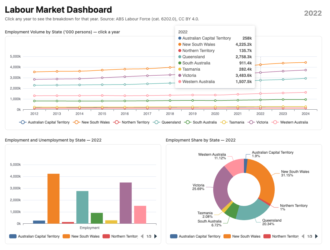
A three-chart dashboard where clicking a year on the top chart updates the two charts below — no custom JavaScript, no Turbo Frames. Turbo Morph handles the DOM update: only what changed re-renders.
The parent chart is a line chart showing employment trends over time. Clicking any year updates two child charts: a grouped bar showing employment and unemployment by state, and a pie chart showing employment share by state — both for the selected year.
The mechanism is adding a select_url value to the main chart. This action will be
triggered when the user clicks on this chart.
|
|
Here’s what we’ll develop:
10.1 — The Service
One service feeds both child charts — annual averages by state for a single year:
|
|
SQL does the aggregation — one query, no Ruby-side averaging. The result is a Hash keyed by state name, each value containing all four metrics.
10.2 — The Components
Parent — LabourForceTimeline (line chart)
Based on the Line Chart template. Adds triggerEvent: true to the x axis so
year labels are clickable:
|
|
Child 1 — LabourForceStateBar (grouped bar)
Based on the Grouped Bar Chart template. Receives the snapshot data hash:
|
|
Child 2 — LabourForceSharePie (pie chart)
Based on the Donut Chart template. Shows employment share by state:
|
|
Same "tableau" palette on all three components — the colour assigned to
each state is consistent across all three charts. NSW is always the same colour
whether it appears as a line, a bar, or a pie slice.
10.3 — The Tooltip Formatter
Add to custom_chart_formatters.js:
|
|
10.4 — Controller and View
|
|
|
|
Note: - we’re adding that labour_dashboard path to the select_url below.
<%# app/views/charts/labour_dashboard.html.erb %>
<div class="max-w-6xl mx-auto px-4 py-8">

  <div class="flex items-center justify-between mb-6">
    <div>
      <h1 class="text-3xl font-bold">Labour Market Dashboard</h1>
      <p class="text-neutral-500 text-sm mt-1">
        Click any year to see the breakdown for that year.
        Source: ABS Labour Force (cat. 6202.0), CC BY 4.0.
      </p>
    </div>
    <div class="text-2xl font-bold text-neutral-400">
      <%= @year %>
    </div>
  </div>

  <%# Parent chart — clicking a year updates the page %>
  <div class="mb-6">
    <h2 class="text-sm font-medium text-neutral-600 mb-1">
      Employment Volume by State ('000 persons) — click a year
    </h2>
    <%= render Components::Charts::LabourForceTimeline.new(
      readings:   @readings,
      select_url: charts_labour_dashboard_path,
      height:     "300px"
    ) %>
  </div>

  <%# Child charts — re-render via Turbo Morph on year selection %>
  <div class="grid grid-cols-2 gap-4">
    <div>
      <h2 class="text-sm font-medium text-neutral-600 mb-1">
        Employment and Unemployment by State — <%= @year %>
      </h2>
      <%= render Components::Charts::LabourForceStateBar.new(
        data:   @snapshot,
        year:   @year,
        height: "320px"
      ) %>
    </div>
    <div>
      <h2 class="text-sm font-medium text-neutral-600 mb-1">
        Employment Share by State — <%= @year %>
      </h2>
      <%= render Components::Charts::LabourForceSharePie.new(
        data:   @snapshot,
        year:   @year,
        height: "320px"
      ) %>
    </div>
  </div>

</div>
10.5— What Turbo Morph Does
When the user clicks “2020” on the timeline:
chart_controller.jscallsTurbo.visit("/charts/labour_dashboard?year=2020")- Turbo fetches the new page
- Morph compares old and new HTML
- The timeline is identical — same options, same ECharts instance — Morph leaves it
- The bar and pie charts have new data — Morph replaces them
- ECharts reinitialises on the new mount divs
- The year heading updates from “2024” to “2020”
No Turbo Frames. No broadcast. No custom stream. The page re-renders completely server-side — Morph surgically updates only what changed.
10.6 — Colour Consistency
All three components use color: "tableau". The service returns states in
alphabetical order — ACT, NSW, NT, QLD, SA, TAS, VIC, WA. ECharts assigns
palette colours in series order.
The result: ACT is always the first tableau colour, NSW always the second — on the line chart, the bar chart, and the pie chart. A reader can identify a state by colour on any chart without reading the legend.
This is the colour correspondence principle from Module 03 applied across an interactive dashboard.
10.7 — Gallery
<%= render "charts/gallery_card",
  title:       "Labour Market Dashboard",
  description: "Click a year on the timeline to see the state breakdown. "\
               "Three chart types, one click, no JavaScript.",
  path:        charts_labour_dashboard_path %>
10.8 — Module Summary
New files:
| File | Purpose |
|---|---|
app/services/stats/labour_force_snapshot.rb |
Single-year averages by state |
app/views/components/charts/labour_force_timeline.rb |
Parent line chart |
app/views/components/charts/labour_force_state_bar.rb |
Child grouped bar |
app/views/components/charts/labour_force_share_pie.rb |
Child pie chart |
Infrastructure changes (see Appendix B and C):
| File | Change |
|---|---|
chart_controller.js |
selectUrl value + #bindClick method |
app/views/components/chart.rb |
select_url: prop |
Patterns introduced:
select_url:prop — opt-in click navigation on any charttriggerEvent: trueon x axis — enables click events on axis labelsTurbo.visitwithaction: "replace"— updates URL without history entry- Turbo Morph — only changed charts re-render, parent chart untouched
params[:year]— controller reads selected year, fetches snapshot data- Colour correspondence across chart types — same palette, same series order
The interaction principle:
The parent chart navigates. The controller fetches. Morph updates. No custom JavaScript per chart. No Turbo Frames. No broadcasts. Click a data point — the page responds.