Lesson 06 — Calendar Heatmap: Daily Economic Activity
What We’re Building
The calendar heatmap maps values onto a calendar grid — each cell is one day, colour encodes the value. Seasonal patterns, weekly rhythms, and one-off events are immediately readable at a glance.
By the end of this module you will have:
- The ECharts calendar coordinate system explained
- A single component that handles any year range — one year or many
visualMapfor the shared colour scale- A custom tooltip formatter with a timezone fix
Here’s what we’ll be building:
6.1 — The Calendar Coordinate System
ECharts’ calendar coordinate system is unlike anything we’ve used so far. Instead of X/Y axes, data is plotted onto a calendar grid. Two options work together:
calendar — defines the grid layout:
|
|
The series — references the calendar via coordinateSystem:
|
|
coordinateSystem: "calendar" is what connects the series to the calendar grid
rather than the default Cartesian axes.
For multiple years, both calendar and series become arrays. Each series
references its grid by index via calendarIndex. This is the key insight of
this module — a single year is a special case of multiple years, where the
arrays each have one element.
6.2 — The Service
|
|
pluck(:date, :value) retrieves only the two columns needed — no full
ActiveRecord objects for 2,557 rows. The result is an array of
[date_string, value] pairs — the exact format ECharts calendar series expects.
6.3 — The Component
A single year is a special case of a multi-year range — both use the same
configuration logic. When year_range: [2022, 2022], the arrays have one
element each. When year_range: [2019, 2021], they have three.
|
|
Why override view_template?
The base Components::Chart renders a fixed height: #{@height} from the
height: prop. This component needs to calculate its height dynamically from
the year range — a single year needs ~220px, three years need ~540px. Overriding
view_template allows dynamic_height to replace the fixed prop.
The override includes chart_group_value and chart_select_url_value — the
same data attributes as the base class — so all inherited props (group:,
select_url:) continue to work correctly.
by_year — grouping data by year
|
|
@data is an array of ["2022-01-15", 94.15] pairs. row.first is the date
string. [0..3] extracts the year characters — "2022". .to_i converts to
an integer. group_by produces { 2022 => [...], 2019 => [...] } — each year’s
data ready to assign to its calendar grid.
calendarIndex
Without calendarIndex, all series plot on the first calendar grid. With it,
each series is assigned to the correct grid by position. Grid 0 gets the first
year, grid 1 the second, and so on.
Shared visualMap
A single visualMap covers all years. This is the key advantage over rendering
multiple single-year components in a loop — all years share one colour scale, so
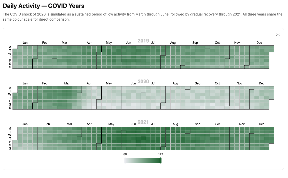
the COVID dip in 2020 is directly comparable to 2019 and 2021. The same shade of
red means the same activity level regardless of which year’s grid it appears in.
6.4 — Tooltip Formatter
Add to custom_chart_formatters.js:
|
|
The "item:" prefix — the tooltip uses trigger: "item", so the resolver
qualifies "calendarDay" as "item:calendarDay" automatically. This is the
same mechanism as Module 04’s "item:participationScatter".
The + "T00:00:00" — new Date("2022-01-15") parses as UTC midnight, which
displays as January 14 in Australian timezones. Appending the time string forces
the browser to parse it as local time.
6.5 — The Plumbing
|
|
|
|
<%# app/views/charts/single_year_calendar.html.erb %>
<h1 class="text-2xl font-bold mb-2">Daily Activity — 2022</h1>
<p class="text-neutral-500 text-sm mb-6">
  Illustrative daily index — generated data, not real ABS statistics.
  Darker cells indicate higher activity.
</p>
<%= render Components::Charts::ActivityCalendar.new(
  data:       @data,
  year_range: [2022, 2022]
) %>
<%# app/views/charts/multi_year_calendar.html.erb %>
<h1 class="text-2xl font-bold mb-2">Daily Activity — COVID Years</h1>
<p class="text-neutral-500 text-sm mb-6">
The COVID shock of 2020 is visible as a sustained period of low activity.
All three years share the same colour scale for direct comparison.
Generated data — not real ABS statistics.
</p>
<%= render Components::Charts::ActivityCalendar.new(
data: @data,
year_range: [2019, 2021]
) %>Gallery cards:
<%= render "charts/gallery_card",
  title:       "Daily Activity — Single Year",
  description: "Calendar heatmap for 2022.",
  path:        charts_single_year_calendar_path %>

<%= render "charts/gallery_card",
  title:       "Daily Activity — COVID Years",
  description: "Multi-year calendar heatmap 2019–2021 on a shared colour scale.",
  path:        charts_multi_year_calendar_path %>
6.6 — Module Summary
New files:
| File | Purpose |
|---|---|
app/services/stats/daily_activity.rb |
Query and shape data for calendar series |
app/views/components/charts/activity_calendar.rb |
Single and multi-year heatmap |
Patterns introduced:
- ECharts calendar coordinate system —
calendaroption +coordinateSystem: "calendar" - Multi-year calendar — arrays of
calendarandserieswithcalendarIndex - Single year as special case —
year_range: [2022, 2022]is one element each - Shared
visualMap— one colour scale across all years for direct comparison view_templateoverride — whendynamic_heightneeds to replace the fixedheight:propby_yeargrouping — extracting year from date string withrow.first[0..3].to_i- UTC date fix —
+ "T00:00:00"for correct local time parsing in JavaScript
Calendar option reference:
| Key | Purpose |
|---|---|
range |
"2022" (year), "2022-03" (month), date range array |
cellSize |
[width, height] — use "auto" for responsive width |
dayLabel.firstDay |
0 = Sunday, 1 = Monday |
calendarIndex |
Which grid a series plots on — essential for multi-year |
Next: Module 07 — Gauge: National Accounts