Skip to content

Module 07 — Gauge Charts: National Accounts

What We’re Building

Gauge charts show a single value in context — where does it sit within a meaningful range, and is it in a good or bad zone? They work best for indicators with clear thresholds and a natural min/max.

This module builds three gauges from the National Accounts dataset — each using a different visual style — connected to a single time slider. Dragging the slider scrubs through 25 years of quarterly data, animating all three gauges simultaneously.

By the end of this module you will have:

  • Three gauge components with different visual styles
  • A Stimulus controller that animates gauges via a time slider
  • A service returning all three indicators as parallel time series
  • ECharts gauge configuration — colour bands, tick marks, labels

Here’s what we’ll be building:

module_08_chart.png


7.1 — The Service

The service returns all three indicators as parallel arrays indexed by quarter. The controller passes this to the component; the component serialises it for the Stimulus controller to scrub through.

 1
 2
 3
 4
 5
 6
 7
 8
 9
10
11
12
13
14
15
16
17
18
19
20
21
22
23
24
25
26
27
28
29
30
31
32
33
34
35
36
37
38
39
40
41
42
43
44
45
# app/services/stats/national_accounts_gauges.rb
module Stats
  module NationalAccountsGauges
    extend self

    # Returns three parallel time series aligned by quarter:
    # {
    #   periods: ["2000 Q1", "2000 Q2", ...],
    #   gdp:     [351.9, 355.3, ...],         # billions
    #   saving:  [3.2, 3.8, ...],             # percent
    #   trade:   [84.2, 85.1, ...]            # index
    # }
    def call
      gdp    = series("Gross domestic product")
      saving = series("Household saving ratio")
      trade  = series("Terms of trade")

      # Align on periods present in all three series
      periods = gdp.keys & saving.keys & trade.keys

      {
        periods: periods.map { |p| period_label(p) },
        gdp:     periods.map { |p| gdp[p] },
        saving:  periods.map { |p| saving[p] },
        trade:   periods.map { |p| trade[p] }
      }
    end

    private

    def series(indicator)
      NationalAccountsReading
        .where(indicator: indicator)
        .order(:year, :quarter)
        .pluck(:year, :quarter, :value)
        .each_with_object({}) do |(year, quarter, value), h|
          h[[year, quarter]] = value.to_f.round(1)
        end
    end

    def period_label(period)
      "#{period[0]} Q#{period[1]}"
    end
  end
end

The service aligns the three series on the intersection of their periods — if one indicator is missing a quarter the others won’t be either, but the intersection guarantees parallel arrays with no nil gaps.


7.2 — The Controller

1
2
3
4
# app/controllers/charts_controller.rb
def national_accounts_gauges
  @data = Stats::NationalAccountsGauges.call
end
1
2
# config/routes.rb
get "charts/national_accounts_gauges", to: "charts#national_accounts_gauges"

7.3 — Gauge Configuration

ECharts gauge charts have a distinctive configuration. The key options:

 1
 2
 3
 4
 5
 6
 7
 8
 9
10
11
12
13
14
15
16
17
18
19
20
21
22
23
24
25
{
  type:       "gauge",
  min:        0,
  max:        100,
  radius:     "75%",
  center:     ["50%", "60%"],
  startAngle: 210,      # degrees — 0 is 3 o'clock, increases clockwise
  endAngle:   -30,      # full arc = 240 degrees
  axisLine: {
    lineStyle: {
      width: 20,        # thickness of the arc
      color: [          # colour bands — [threshold, colour] pairs, 0.0–1.0
        [0.3, "#f87171"],   # 0–30% of range: red
        [0.7, "#fbbf24"],   # 30–70%: amber
        [1.0, "#34d399"]    # 70–100%: green
      ]
    }
  },
  pointer:    { length: "60%", width: 6 },
  axisTick:   { distance: -25, length: 8 },
  splitLine:  { distance: -30, length: 14 },
  axisLabel:  { distance: -45, fontSize: 10 },
  detail:     { valueAnimation: true, formatter: "{value}", fontSize: 14 },
  data:       [{ value: 42.3, name: "Current" }]
}

Colour bands are defined as [threshold, colour] pairs where threshold is a fraction of the full range (0.0–1.0). The arc fills left to right — the needle sits on the arc and the band behind it shows the zone.

startAngle: 210, endAngle: -30 — ECharts angles are measured clockwise from 3 o’clock. 210° puts the start at the bottom-left; -30° (or 330°) puts the end at the bottom-right. This gives the classic gauge shape.

detail — the numeric readout below the needle. valueAnimation: true makes it count up/down smoothly when the value changes.


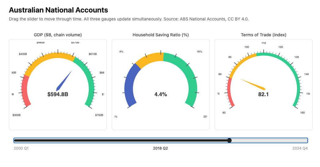
7.4 — Chart 1: GDP Gauge (Needle Style)

GDP in chain volume measures, billions of dollars. The range covers the full dataset — approximately $350B (2000) to $700B (2024).

Colour bands:

  • Red: below $450B — pre-GFC levels, now considered low
  • Amber: $450B–$580B — moderate
  • Green: above $580B — strong/recent
 1
 2
 3
 4
 5
 6
 7
 8
 9
10
11
12
13
14
15
16
17
18
19
20
21
22
23
24
25
26
27
28
29
30
31
32
33
34
35
36
37
38
39
40
41
42
43
44
45
46
47
48
49
50
# app/views/components/charts/gdp_gauge.rb
module Components
  module Charts
    class GdpGauge < Components::Chart
      prop :value,  Float,  default: -> { 0.0 }
      prop :period, String, default: -> { "" }

      private

      def chart_options
        ::Chart::Options.new(
          series: [
            {
              type:       "gauge",
              min:        300,
              max:        750,
              radius:     "85%",
              center:     ["50%", "55%"],
              startAngle: 210,
              endAngle:   -30,
              axisLine: {
                lineStyle: {
                  width: 18,
                  color: [
                    [0.22, "#f87171"],
                    [0.62, "#fbbf24"],
                    [1.0,  "#34d399"]
                  ]
                }
              },
              pointer:   { length: "65%", width: 5 },
              axisTick:  { distance: -22, length: 6,  lineStyle: { width: 1 } },
              splitLine: { distance: -28, length: 14, lineStyle: { width: 2 } },
              axisLabel: { distance: -38, fontSize: 9, formatter: "${value}B" },
              title:     { offsetCenter: ["0%", "-15%"], fontSize: 12 },
              detail: {
                valueAnimation: true,
                formatter:      "${value}B",
                fontSize:       18,
                fontWeight:     "bold",
                offsetCenter:   ["0%", "15%"]
              },
              data: [{ value: @value, name: "GDP" }]
            }
          ]
        )
      end
    end
  end
end

7.5 — Chart 2: Saving Ratio Gauge (Arc Style)

Household saving ratio — what percentage of income households are saving. The COVID spike to ~20% and subsequent collapse below zero is one of the most dramatic movements in the dataset.

Arc style uses a wider axisLine and no pointer — the arc fill itself indicates the value. Achieved by setting pointer: { show: false } and increasing axisLine width.

Colour bands:

  • Red: below 2% — households are spending more than they earn (dissaving)
  • Amber: 2%–8% — moderate saving
  • Green: above 8% — strong saving (pandemic behaviour, post-GFC caution)
 1
 2
 3
 4
 5
 6
 7
 8
 9
10
11
12
13
14
15
16
17
18
19
20
21
22
23
24
25
26
27
28
29
30
31
32
33
34
35
36
37
38
39
40
41
42
43
44
45
46
47
48
49
50
51
# app/views/components/charts/saving_gauge.rb
module Components
  module Charts
    class SavingGauge < Components::Chart
      prop :value,  Float,  default: -> { 0.0 }
      prop :period, String, default: -> { "" }

      private

      def chart_options
        ::Chart::Options.new(
          series: [
            {
              type:       "gauge",
              min:        -5,
              max:        25,
              radius:     "85%",
              center:     ["50%", "55%"],
              startAngle: 210,
              endAngle:   -30,
              axisLine: {
                lineStyle: {
                  width: 28,
                  color: [
                    [0.23, "#f87171"],
                    [0.52, "#fbbf24"],
                    [1.0,  "#34d399"]
                  ]
                }
              },
              pointer:   { show: false },
              progress:  { show: true, width: 28 },
              axisTick:  { show: false },
              splitLine: { distance: -35, length: 14, lineStyle: { width: 2 } },
              axisLabel: { distance: -42, fontSize: 9, formatter: "{value}%" },
              title:     { offsetCenter: ["0%", "-15%"], fontSize: 12 },
              detail: {
                valueAnimation: true,
                formatter:      "{value}%",
                fontSize:       18,
                fontWeight:     "bold",
                offsetCenter:   ["0%", "15%"]
              },
              data: [{ value: @value, name: "Saving Ratio" }]
            }
          ]
        )
      end
    end
  end
end

progress: { show: true, width: 28 } fills the arc up to the current value — the “progress bar” style. With pointer: { show: false } the filled arc is the only indicator of the current value.


7.6 — Chart 3: Terms of Trade Gauge (Speedometer Style)

Terms of trade — Australia’s export prices relative to import prices, indexed to 100. Values above 100 mean exports are relatively more valuable (good for Australia); below 100 means imports are relatively expensive.

Speedometer style uses finer tick marks and a thinner arc — more like a car’s rev counter than a fuel gauge.

Colour bands:

  • Red: below 80 — unfavourable terms
  • Amber: 80–105 — near-neutral
  • Green: above 105 — favourable (mining boom territory)
 1
 2
 3
 4
 5
 6
 7
 8
 9
10
11
12
13
14
15
16
17
18
19
20
21
22
23
24
25
26
27
28
29
30
31
32
33
34
35
36
37
38
39
40
41
42
43
44
45
46
47
48
49
50
51
52
53
54
55
# app/views/components/charts/trade_gauge.rb
module Components
  module Charts
    class TradeGauge < Components::Chart
      prop :value,  Float,  default: -> { 0.0 }
      prop :period, String, default: -> { "" }

      private

      def chart_options
        ::Chart::Options.new(
          series: [
            {
              type:       "gauge",
              min:        60,
              max:        160,
              radius:     "85%",
              center:     ["50%", "55%"],
              startAngle: 210,
              endAngle:   -30,
              splitNumber: 10,
              axisLine: {
                lineStyle: {
                  width: 10,
                  color: [
                    [0.2,  "#f87171"],
                    [0.45, "#fbbf24"],
                    [1.0,  "#34d399"]
                  ]
                }
              },
              pointer: {
                length:    "70%",
                width:     4,
                itemStyle: { color: "auto" }
              },
              axisTick:  { distance: -15, length: 5,  splitNumber: 5 },
              splitLine: { distance: -20, length: 12, lineStyle: { width: 2 } },
              axisLabel: { distance: -28, fontSize: 9 },
              title:     { offsetCenter: ["0%", "-15%"], fontSize: 12 },
              detail: {
                valueAnimation: true,
                formatter:      "{value}",
                fontSize:       18,
                fontWeight:     "bold",
                offsetCenter:   ["0%", "15%"]
              },
              data: [{ value: @value, name: "Terms of Trade" }]
            }
          ]
        )
      end
    end
  end
end

pointer: { itemStyle: { color: "auto" } } colours the needle to match the colour band it’s currently pointing at — a nice visual touch.

splitNumber: 10 increases the number of major tick divisions — the “speedometer” effect comes from having more granular markings.


7.7 — The Stimulus Controller

The slider controller holds all time series data as a Stimulus value. On input it reads the current slider position, extracts the values for that quarter, and calls setOption on each gauge chart instance.

 1
 2
 3
 4
 5
 6
 7
 8
 9
10
11
12
13
14
15
16
17
18
19
20
21
22
23
24
25
26
27
28
29
30
31
32
33
34
35
36
37
38
39
40
// app/javascript/controllers/gauge_slider_controller.js
import { Controller } from "@hotwired/stimulus"
import * as echarts from "echarts"

export default class extends Controller {
  static targets  = ["slider", "period", "gdp", "saving", "trade"]
  static values   = { data: Object }

  connect() {
    // Initialise at the latest quarter
    this.sliderTarget.max   = this.dataValue.periods.length - 1
    this.sliderTarget.value = this.sliderTarget.max
    this.update()
  }

  update() {
    const i       = parseInt(this.sliderTarget.value)
    const data    = this.dataValue
    const period  = data.periods[i]
    const gdp     = data.gdp[i]
    const saving  = data.saving[i]
    const trade   = data.trade[i]

    // Update period label
    this.periodTarget.textContent = period

    // Update each gauge via its ECharts instance
    this.#setGauge(this.gdpTarget,    gdp)
    this.#setGauge(this.savingTarget, saving)
    this.#setGauge(this.tradeTarget,  trade)
  }

  #setGauge(el, value) {
    const chart = echarts.getInstanceByDom(el)
    if (!chart) return
    chart.setOption({
      series: [{ data: [{ value: parseFloat(value) }] }]
    }, { notMerge: false })
  }
}

echarts.getInstanceByDom(el) retrieves the ECharts instance attached to a DOM element — this is how the slider controller accesses gauge instances initialised by chart_controller.js without needing a direct reference.

setOption with notMerge: false merges the new value into the existing options — only the data changes, all configuration stays intact. ECharts animates the needle movement automatically.


7.8 — The View

<%# app/views/charts/national_accounts_gauges.html.erb %>

<div class="max-w-5xl mx-auto px-4 py-8"
     data-controller="gauge-slider"
     data-gauge-slider-data-value="<%= @data.to_json %>">

  <h1 class="text-2xl font-bold mb-1">Australian National Accounts</h1>
  <p class="text-neutral-500 text-sm mb-8">
    Drag the slider to move through time. All three gauges update simultaneously.
    Source: ABS National Accounts, CC BY 4.0.
  </p>

  <%# Three gauges side by side %>
  <div class="grid grid-cols-3 gap-4 mb-6">
    <div>
      <p class="text-center text-sm font-medium text-neutral-600 mb-1">
        GDP ($B, chain volume)
      </p>
      <div data-gauge-slider-target="gdp">
        <%= render Components::Charts::GdpGauge.new(
          value:  @data[:gdp].last,
          height: "280px"
        ) %>
      </div>
    </div>
    <div>
      <p class="text-center text-sm font-medium text-neutral-600 mb-1">
        Household Saving Ratio (%)
      </p>
      <div data-gauge-slider-target="saving">
        <%= render Components::Charts::SavingGauge.new(
          value:  @data[:saving].last,
          height: "280px"
        ) %>
      </div>
    </div>
    <div>
      <p class="text-center text-sm font-medium text-neutral-600 mb-1">
        Terms of Trade (index)
      </p>
      <div data-gauge-slider-target="trade">
        <%= render Components::Charts::TradeGauge.new(
          value:  @data[:trade].last,
          height: "280px"
        ) %>
      </div>
    </div>
  </div>

  <%# Slider and period label %>
  <div class="px-4">
    <input type="range"
           min="0"
           max="<%= @data[:periods].length - 1 %>"
           value="<%= @data[:periods].length - 1 %>"
           class="w-full accent-neutral-800"
           data-gauge-slider-target="slider"
           data-action="input->gauge-slider#update">
    <div class="flex justify-between text-xs text-neutral-400 mt-1">
      <span><%= @data[:periods].first %></span>
      <span class="font-medium text-neutral-700"
            data-gauge-slider-target="period">
        <%= @data[:periods].last %>
      </span>
      <span><%= @data[:periods].last %></span>
    </div>
  </div>

</div>

The Stimulus controller wraps the entire section — data-controller="gauge-slider". The serialised data sits on the same element as a Stimulus value — @data.to_json passes all periods and values to JavaScript in one shot.

Each gauge is wrapped in a data-gauge-slider-target div. The slider controller uses echarts.getInstanceByDom to find the ECharts instance inside each wrapper.


7.9 — How getInstanceByDom Works

chart_controller.js initialises an ECharts instance on the mount div. ECharts registers that instance internally, keyed to the DOM element. getInstanceByDom retrieves it by element reference.

The gauge slider targets are the wrapper divs — not the mount divs — so we need to find the mount div inside:

1
2
3
4
5
6
7
8
#setGauge(wrapperEl, value) {
  const mountEl = wrapperEl.querySelector("[data-chart-target='mount']")
  const chart   = echarts.getInstanceByDom(mountEl)
  if (!chart) return
  chart.setOption({
    series: [{ data: [{ value: parseFloat(value) }] }]
  }, { notMerge: false })
}

This is the correct version — getInstanceByDom needs the exact element that echarts.init was called on, which is the mount div.


7.10 — Gallery

<%= render "charts/gallery_card",
  title:       "National Accounts Gauges",
  description: "Three gauge styles — needle, arc, speedometer — animated by a "\
               "time slider across 25 years of quarterly data.",
  path:        charts_national_accounts_gauges_path %>

7.11 — Module Summary

New files:

File Purpose
app/services/stats/national_accounts_gauges.rb Three aligned time series
app/views/components/charts/gdp_gauge.rb Needle gauge — GDP
app/views/components/charts/saving_gauge.rb Arc/progress gauge — saving ratio
app/views/components/charts/trade_gauge.rb Speedometer gauge — terms of trade
app/javascript/controllers/gauge_slider_controller.js Time slider animation

Patterns introduced:

  • ECharts gauge chart configuration — min, max, startAngle, endAngle
  • Colour bands — axisLine.lineStyle.color threshold array
  • Three gauge styles — needle, arc/progress (progress: { show: true }), speedometer
  • pointer: { itemStyle: { color: "auto" } } — needle matches current band colour
  • valueAnimation: true — smooth numeric readout transitions
  • echarts.getInstanceByDom — accessing an existing ECharts instance from another controller
  • Stimulus across multiple chart instances — one controller, multiple gauges
  • setOption with notMerge: false — partial update without full re-render

Gauge configuration quick reference:

Option Purpose
startAngle / endAngle Arc extent — 210/-30 gives classic gauge shape
axisLine.lineStyle.color Colour bands as [threshold, colour] pairs (0–1)
progress: { show: true } Fill arc to current value (arc style)
pointer: { show: false } Hide needle (arc style only)
pointer.itemStyle.color: "auto" Needle matches current band
detail.valueAnimation Animate the numeric readout
splitNumber Number of major divisions (higher = speedometer effect)