Skip to content

Module 05 — Pie, Donut, and Rose Charts: Industry Sales Composition

What We’re Building

Pie and donut charts show composition — how a whole divides into parts. This module builds four variants of the same chart from one dataset and one service, demonstrating how much variety is available from a single Chart::Series::Pie configuration.

By the end of this module you will have:

  • Chart::Series::Pie — a new series type
  • A basic pie chart
  • A donut chart with a centre label
  • A rose (nightingale) chart
  • A half-donut dashboard variant
  • Rich item-trigger tooltip formatters
  • The **extra escape hatch in practice

Here’s what we’re building:

pie_donut_charts.png


5.1 — Chart::Series::Pie

Pie charts use a single series. The data is an array of { name:, value: } hashes — not parallel arrays like line and bar charts.

The equivalent JavaScript:

 1
 2
 3
 4
 5
 6
 7
 8
 9
10
series: [{
  type:   "pie",
  name:   "Industry Sales",
  radius: "65%",
  data: [
    { name: "Mining",        value: 142.3 },
    { name: "Construction",  value: 98.7  },
    ...
  ]
}]

In Ruby:

1
2
3
4
5
6
7
8
::Chart::Series::Pie.new(
  name:   "Industry Sales",
  radius: "65%",
  data:   [
    { name: "Mining",       value: 142.3 },
    { name: "Construction", value: 98.7  }
  ]
)

Chart::Series::Pie adds type: "pie" automatically. radius:, center:, label:, and emphasis: are common options that pass through unchanged.

The **extra escape hatch

Some pie chart variants require options not in everyday use — roseType:, startAngle:, endAngle:. These are not modelled explicitly in the DSL. They pass through **opts in Chart::Series::Base unchanged:

1
2
3
4
5
6
7
::Chart::Series::Pie.new(
  name:       "Industry Sales",
  data:       series_data,
  roseType:   "radius",   # not modelled — passes through
  startAngle: 180,        # not modelled — passes through
  endAngle:   360         # not modelled — passes through
)

This is the intended use of the escape hatch — ECharts has hundreds of series options. The DSL models the most common ones; everything else just works.

Item trigger tooltips

Pie charts use trigger: "item" — the tooltip fires on a single slice, not on a cross-axis position. The params object contains the slice name, value, and ECharts’ calculated percentage:

1
tooltip: { trigger: "item", formatter: "industrySlice" }

The resolver qualifies "industrySlice" with the trigger automatically — it looks up "item:industrySlice" in the formatter registry. Add to custom_chart_formatters.js:

 1
 2
 3
 4
 5
 6
 7
 8
 9
10
11
12
13
14
15
16
17
18
19
20
21
22
23
24
25
26
27
28
"item:industrySlice": params => {
  const rank = params.dataIndex + 1
  return `
    <div style="min-width:200px">
      <div style="font-weight:600;margin-bottom:4px">
        ${params.marker}${params.name}
      </div>
      <table style="width:100%;border-collapse:collapse">
        <tr>
          <td style="color:#999;padding-right:12px">Sales</td>
          <td style="text-align:right;font-weight:600">
            $${params.value.toLocaleString()}B
          </td>
        </tr>
        <tr>
          <td style="color:#999;padding-right:12px">Share</td>
          <td style="text-align:right;font-weight:600">
            ${params.percent.toFixed(1)}%
          </td>
        </tr>
        <tr>
          <td style="color:#999;padding-right:12px">Rank</td>
          <td style="text-align:right;font-weight:600">#${rank}</td>
        </tr>
      </table>
    </div>
  `
}

params.dataIndex is the zero-based position of the slice in the data array — adding 1 gives the rank. params.percent is ECharts’ calculated percentage — you don’t need to compute it yourself.

ECharts label template variables

The label.formatter string supports template variables that ECharts resolves before rendering:

Variable Value
{a} Series name
{b} Slice name
{c} Value
{d} Percentage (calculated by ECharts)
1
label: { formatter: "{b}\n{d}%" }   # "Mining\n18.4%"

These pass through the formatter resolver unchanged — they are not in the registry and ECharts handles them natively.


5.2 — The Service

The service selects the latest quarter’s data, rejects zero-value and total rows, and computes the percentage share for each industry. All transformation happens in the service — components receive clean data.

 1
 2
 3
 4
 5
 6
 7
 8
 9
10
11
12
13
14
15
16
17
18
19
20
21
22
23
24
25
26
27
28
29
30
31
32
33
34
35
# app/services/stats/business_composition.rb
module Stats
  module BusinessComposition
    extend self

    # Returns industries for the latest quarter, sorted by sales descending:
    # [
    #   { industry: "Mining",       sales: 142.3, share: 18.4 },
    #   { industry: "Construction", sales: 98.7,  share: 12.6 },
    #   ...
    # ]
    def call
      latest_year    = BusinessIndicatorReading.maximum(:year)
      latest_quarter = BusinessIndicatorReading
                         .where(year: latest_year)
                         .maximum(:quarter)

      readings = BusinessIndicatorReading
                   .where(year: latest_year, quarter: latest_quarter)
                   .where.not(industry: "Total")
                   .where("sales_billions > 0")
                   .order(sales_billions: :desc)

      total = readings.sum(:sales_billions).to_f

      readings.map do |r|
        {
          industry: r.industry,
          sales:    r.sales_billions.to_f.round(1),
          share:    ((r.sales_billions.to_f / total) * 100).round(1)
        }
      end
    end
  end
end

The service takes no arguments — it always returns the latest quarter. The database does the filtering and ordering. No Ruby-side .select or .reject on a loaded collection.

Why pre-compute share? ECharts calculates params.percent for tooltips, but having share in the data means it is available for tests, CSV exports, and any other consumer of this service without recomputing it.


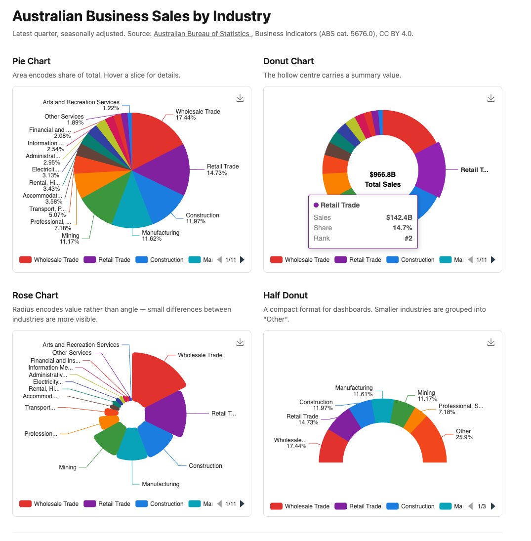
5.3 — Chart 1: Basic Pie Chart

 1
 2
 3
 4
 5
 6
 7
 8
 9
10
11
12
13
14
15
16
17
18
19
20
21
22
23
24
25
26
27
28
29
30
31
32
# app/views/components/charts/industry_pie.rb
module Components
  module Charts
    class IndustryPie < Components::Chart
      prop :data, _Any, default: -> { [] }

      private

      def chart_options
        ::Chart::Options.new(
          color:   "vivid",
          toolbox: { feature: { saveAsImage: {} } },
          tooltip: { trigger: "item", formatter: "industrySlice" },
          legend:  { type: "scroll", bottom: 5 },
          series: [
            ::Chart::Series::Pie.new(
              name:   "Industry Sales",
              data:   series_data,
              radius: "65%",
              center: ["50%", "45%"],
              label:  { formatter: "{b}\n{d}%" }
            )
          ]
        )
      end

      def series_data
        @data.map { |r| { name: r[:industry], value: r[:sales] } }
      end
    end
  end
end

series_data is extracted into a private method — all four components use the same mapping. Keeping it named makes chart_options readable.


5.4 — Chart 2: Donut with Centre Label

A donut is a pie with an inner radius. radius: ["40%", "68%"] — the first value is the inner radius, the second the outer. The gap between them is the donut hole.

ECharts has no native centre label. The graphic option overlays arbitrary elements on the chart canvas:

 1
 2
 3
 4
 5
 6
 7
 8
 9
10
11
12
13
14
15
16
17
18
19
20
21
22
23
24
25
26
27
28
29
30
31
32
33
34
35
36
37
38
39
40
41
42
43
44
45
46
47
48
49
50
51
# app/views/components/charts/industry_donut.rb
module Components
  module Charts
    class IndustryDonut < Components::Chart
      prop :data, _Any, default: -> { [] }

      private

      def chart_options
        total = @data.sum { |r| r[:sales] }.round(1)

        ::Chart::Options.new(
          color:   "vivid",
          toolbox: { feature: { saveAsImage: {} } },
          tooltip: { trigger: "item", formatter: "industrySlice" },
          legend:  { type: "scroll", bottom: 5 },
          graphic: [
            {
              type:  "text",
              left:  "center",
              top:   "middle",
              style: {
                text:       "$#{total}B\nTotal Sales",
                textAlign:  "center",
                fontSize:   14,
                fontWeight: "bold",
                lineHeight: 20
              }
            }
          ],
          series: [
            ::Chart::Series::Pie.new(
              name:     "Industry Sales",
              data:     series_data,
              radius:   ["40%", "68%"],
              center:   ["50%", "45%"],
              label:    { show: false },
              emphasis: {
                label: { show: true, fontSize: 13, fontWeight: "bold" }
              }
            )
          ]
        )
      end

      def series_data
        @data.map { |r| { name: r[:industry], value: r[:sales] } }
      end
    end
  end
end

label: { show: false } hides slice labels — the graphic overlay replaces them. emphasis.label shows a label when a slice is hovered.

left: "center" and top: "middle" centre the graphic in the chart container. This aligns with the donut hole because the donut is also centred at ["50%", "45%"].


5.5 — Chart 3: Rose Chart

A rose (nightingale) chart gives each slice an equal angle but varies the radius by value. Differences between similar-sized industries are more visible than in a standard pie.

roseType: "radius" is not modelled in the DSL — it passes through via **extra:

 1
 2
 3
 4
 5
 6
 7
 8
 9
10
11
12
13
14
15
16
17
18
19
20
21
22
23
24
25
26
27
28
29
30
31
32
33
34
# app/views/components/charts/industry_rose.rb
module Components
  module Charts
    class IndustryRose < Components::Chart
      prop :data, _Any, default: -> { [] }

      private

      def chart_options
        ::Chart::Options.new(
          color:   "vivid",
          toolbox: { feature: { saveAsImage: {} } },
          tooltip: { trigger: "item", formatter: "industrySlice" },
          legend:  { type: "scroll", bottom: 5 },
          series: [
            ::Chart::Series::Pie.new(
              name:      "Industry Sales",
              data:      series_data,
              radius:    ["15%", "70%"],
              center:    ["50%", "45%"],
              roseType:  "radius",
              label:     { formatter: "{b}" },
              itemStyle: { borderRadius: 6 }
            )
          ]
        )
      end

      def series_data
        @data.map { |r| { name: r[:industry], value: r[:sales] } }
      end
    end
  end
end

radius: ["15%", "70%"] gives the rose an inner radius — combining donut and rose modes. Without it the smallest slices collapse to a point at the centre.

itemStyle: { borderRadius: 6 } rounds the corners of each slice — a subtle refinement that improves readability when slices are narrow. Passed through **extra.


5.6 — Chart 4: Half Donut

startAngle: 180 and endAngle: 360 render only the top semicircle. The smaller industries are grouped into “Other” in the service helper — a half donut with 15 slices is unreadable.

 1
 2
 3
 4
 5
 6
 7
 8
 9
10
11
12
13
14
15
16
17
18
19
20
21
22
23
24
25
26
27
28
29
30
31
32
33
34
35
36
37
38
39
40
41
# app/views/components/charts/industry_half_donut.rb
module Components
  module Charts
    class IndustryHalfDonut < Components::Chart
      prop :data, _Any, default: -> { [] }

      private

      def chart_options
        ::Chart::Options.new(
          color:   "vivid",
          toolbox: { feature: { saveAsImage: {} } },
          tooltip: { trigger: "item", formatter: "industrySlice" },
          legend:  { type: "scroll", bottom: 0 },
          series: [
            ::Chart::Series::Pie.new(
              name:       "Industry Sales",
              data:       series_data,
              radius:     ["45%", "72%"],
              center:     ["50%", "72%"],
              startAngle: 180,
              endAngle:   360,
              label:      { position: "outside", formatter: "{b}\n{d}%" }
            )
          ]
        )
      end

      def series_data
        top6  = @data.first(6)
        other = @data[6..]

        return top6.map { |r| { name: r[:industry], value: r[:sales] } } if other.empty?

        other_sales = other.sum { |r| r[:sales] }.round(1)
        (top6 + [{ industry: "Other", sales: other_sales }])
          .map { |r| { name: r[:industry], value: r[:sales] } }
      end
    end
  end
end

center: ["50%", "72%"] shifts the centre point down so the flat edge sits near the bottom of the chart area. startAngle: 180 and endAngle: 360 pass through via **extra.

The “Other” grouping is a presentation concern — it belongs in series_data, not in the service. The service returns all industries; the component decides how many to show.


5.7 — The Plumbing

The service takes no arguments — the controller simply calls it:

1
2
3
4
# app/controllers/charts_controller.rb
def industry_composition
  @data = Stats::BusinessComposition.call
end
1
2
3
4
# config/routes.rb
get "charts/industry_composition",
    to:  "charts#industry_composition",
    as:  :charts_industry_composition
<%# app/views/charts/industry_composition.html.erb %>
<div class="max-w-5xl mx-auto px-4 py-8">

  <h1 class="text-3xl font-bold mb-2">Australian Business Sales by Industry</h1>
  <p class="text-neutral-500 text-sm mb-8">
    Latest quarter, seasonally adjusted.
    Source: <a href="https://www.abs.gov.au" class="underline">
      Australian Bureau of Statistics
    </a>, Business Indicators (ABS cat. 5676.0), CC BY 4.0.
  </p>

  <div class="grid grid-cols-2 gap-6 mb-8">
    <div>
      <h2 class="text-lg font-semibold mb-1">Pie Chart</h2>
      <p class="text-neutral-500 text-sm mb-3">
        Area encodes share of total. Hover a slice for details.
      </p>
      <%= render Components::Charts::IndustryPie.new(
        data:   @data,
        height: "360px"
      ) %>
    </div>
    <div>
      <h2 class="text-lg font-semibold mb-1">Donut Chart</h2>
      <p class="text-neutral-500 text-sm mb-3">
        The hollow centre carries a summary value.
      </p>
      <%= render Components::Charts::IndustryDonut.new(
        data:   @data,
        height: "360px"
      ) %>
    </div>
  </div>

  <div class="grid grid-cols-2 gap-6 mb-8">
    <div>
      <h2 class="text-lg font-semibold mb-1">Rose Chart</h2>
      <p class="text-neutral-500 text-sm mb-3">
        Radius encodes value rather than angle — small differences between
        industries are more visible.
      </p>
      <%= render Components::Charts::IndustryRose.new(
        data:   @data,
        height: "360px"
      ) %>
    </div>
    <div>
      <h2 class="text-lg font-semibold mb-1">Half Donut</h2>
      <p class="text-neutral-500 text-sm mb-3">
        A compact format for dashboards. Smaller industries are grouped
        into "Other".
      </p>
      <%= render Components::Charts::IndustryHalfDonut.new(
        data:   @data,
        height: "360px"
      ) %>
    </div>
  </div>

  <div class="border-t border-neutral-200 pt-6">
    <p class="text-neutral-400 text-xs">
      Data: ABS Business Indicators, Australia (cat. 5676.0).
      Accessed via ABS Data API. CC BY 4.0.
    </p>
  </div>

</div>

Gallery card:

<%= render "charts/gallery_card",
  title:       "Industry Composition",
  description: "Four pie/donut variants — pie, donut, rose, and half donut — "\
               "showing Australian business sales by industry.",
  path:        charts_industry_composition_path %>

5.8 — Module Summary

New files:

File Purpose
app/services/stats/business_composition.rb Latest quarter sales by industry
app/views/components/charts/industry_pie.rb Standard pie chart
app/views/components/charts/industry_donut.rb Donut with centre label
app/views/components/charts/industry_rose.rb Rose/nightingale chart
app/views/components/charts/industry_half_donut.rb Half donut dashboard variant

Patterns introduced:

  • Chart::Series::Pie{ name:, value: } data format
  • radius: ["inner%", "outer%"] — creates the donut hole
  • graphic option — arbitrary text overlay for centre labels
  • roseType: "radius" — nightingale/rose mode via **extra
  • startAngle / endAngle — half donut via **extra
  • emphasis.label — hover-activated slice labels
  • trigger: "item" tooltip — single slice, not cross-axis
  • item: prefix — qualifier for item-trigger formatters
  • ECharts label template variables — {b}, {c}, {d}
  • **extra escape hatch — passing options not modelled in the DSL
  • “Other” grouping as a presentation concern in series_data

When to use each variant:

Variant Use when
Pie 5–8 categories, proportions are the message
Donut Summary value in centre, dashboard layout
Rose Similar-magnitude values, visual impact over precision
Half donut Vertical space constrained, 6 or fewer categories

Next: Module 06 — Calendar Heatmap: Daily Activity