Module 04 — Scatter Charts: Labour Market Analysis
What We’re Building
This module introduces scatter charts and a pattern that matters beyond chart mechanics: charts as supporting evidence for prose. Real pages rarely show a chart in isolation — they surround it with context, explanation, and narrative.
We build a single page that tells a story about the Australian labour market using three charts interspersed with text. One controller action, one service, three components.
By the end of this module you will have:
Chart::Series::Scatter— a new series typevisualMap— encoding a third dimension as colourmarkLine— reference line annotations- A data story page mixing prose and charts
- Colour correspondence across multiple charts on the same page
No new service — all three charts reuse Stats::LabourForce from Module 03.
Here’s what we’re building:
4.1 — Chart::Series::Scatter
Scatter charts plot points at [x, y] coordinates. Each series is a collection
of points — one per state, one per year in our case.
The equivalent JavaScript:
|
|
In Ruby:
|
|
Chart::Series::Scatter adds type: "scatter" automatically. The data is an
array of [x, y] pairs — or [x, y, z] if a third dimension is needed.
Value axes — start from the data, not zero. Scatter charts use type: "value"
on both axes. ECharts defaults to starting value axes at zero — which bunches all
points into one corner when your data doesn’t go near zero. Set min: "dataMin"
on both axes to fit the scale to the actual data range:
|
|
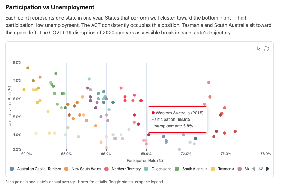
4.2 — Chart 1: Participation vs Unemployment Scatter
Each point is one state in one year. X axis is participation rate, Y axis is unemployment rate. Each state is its own series — its own colour, its own legend entry, toggleable independently.
visualMap
visualMap encodes a third dimension as a visual property — in this case, year
as colour lightness. Earlier years appear darker, recent years lighter. The time
progression becomes visible without adding a separate series per year.
|
|
dimension: 2 — array index 2, the third element. colorLightness maps the
min year to shade 0.35 (darker) and the max year to 0.85 (lighter). Reverse
the array to invert.
show: false — the legend already identifies states by colour. A second colour
scale widget would be confusing.
With visualMap active, each data point needs the third dimension:
|
|
The component
|
|
Custom tooltip formatter
The default item formatter shows a raw array — not readable. Add to
custom_chart_formatters.js:
|
|
The key is "item:participationScatter" — the item: prefix matches the
trigger: "item" on the tooltip. The resolver in chart_controller.js qualifies
the lookup automatically when you write formatter: "participationScatter" in
Ruby. Custom formatters were introduced in Module 02 — this is the first one we
add to custom_chart_formatters.js.
4.3 — Chart 2: Employment Volume Over Time
A line chart showing absolute employment numbers per state. Same service, same data structure, different question: not the ratio of workers to population, but the raw scale of each state’s economy.
|
|
4.4 — Chart 3: Participation Rate Trends
The third chart shows participation rate over time. A clean multi-series line
chart with min: "dataMin" on the Y axis — participation rates range from
roughly 60–76%, so starting at zero wastes most of the chart height.
|
|
markLine — for adding reference lines such as a national average — is covered
in Module 09 with a dedicated example.
4.5 — Colour Correspondence
All three charts use color: "tableau". The service returns states in
alphabetical order — Stats::LabourForce uses group_by which preserves
insertion order, and LabourForceReading.ordered orders by state name. ECharts
assigns colours from the palette in series order.
The result: ACT is always the first tableau colour, NSW always the second — across the scatter chart, the line chart, and the participation chart. A reader identifies Queensland by colour on Chart 1 and finds Queensland immediately on Charts 2 and 3 without reading the legend again.
The rule: same palette + same series order = same colour mapping. The service
guarantees the order. You guarantee the palette by using the same color: value
on all charts on the page.
4.6 — Testing
Chart option generation is pure Ruby — no browser, no JavaScript, no Rails. Pass
plain model objects built with .new, call chart_options, assert on the hash:
|
|
The component now receives data: directly — no service call inside the
component — so the test passes shaped data straight in. No database, no fixtures,
no ActiveRecord.
4.7 — The Plumbing
|
|
|
|
<%# app/views/charts/labour_market_analysis.html.erb %>
<div class="max-w-4xl mx-auto px-4 py-8">

  <h1 class="text-3xl font-bold mb-2">Australian Labour Market by State</h1>
  <p class="text-neutral-500 text-sm mb-8">
    Annual averages, seasonally adjusted, 2012–2024.
    Source: <a href="https://www.abs.gov.au" class="underline">
      Australian Bureau of Statistics
    </a>, Labour Force (ABS cat. 6202.0), CC BY 4.0.
  </p>

  <h2 class="text-xl font-semibold mb-2">Participation vs Unemployment</h2>
  <p class="text-neutral-600 mb-4">
    Each point represents one state in one year. States that perform well cluster
    toward the bottom-right — high participation, low unemployment. The ACT
    consistently occupies this position. Tasmania and South Australia sit toward
    the upper-left. The COVID-19 disruption of 2020 appears as a visible break
    in each state's trajectory.
  </p>
  <%= render Components::Charts::ParticipationScatter.new(
    data:   @data,
    height: "420px"
  ) %>
  <p class="text-neutral-500 text-xs mt-2 mb-10">
    Each point is one state's annual average. Hover for details.
    Toggle states using the legend.
  </p>

  <h2 class="text-xl font-semibold mb-2">Employment Volume</h2>
  <p class="text-neutral-600 mb-4">
    New South Wales and Victoria together employ more than the other six states
    combined. The COVID dip in 2020 is followed by a sharp recovery across all
    states. Western Australia shows the most volatility — the resources sector
    is sensitive to commodity cycles.
  </p>
  <%= render Components::Charts::EmploymentTrends.new(
    data:   @data,
    height: "380px"
  ) %>
  <p class="text-neutral-500 text-xs mt-2 mb-10">
    Annual average employed persons ('000). Hover to compare states at a given year.
  </p>

  <h2 class="text-xl font-semibold mb-2">Participation Rate Trends</h2>
  <p class="text-neutral-600 mb-4">
    The ACT's participation rate is structurally higher due to its demographic
    profile. The national average has been broadly flat, masking diverging trends:
    Queensland and Western Australia have lifted, while South Australia and
    Tasmania have lagged.
  </p>
  <%= render Components::Charts::ParticipationTrends.new(
    data:   @data,
    height: "380px"
  ) %>
  <p class="text-neutral-500 text-xs mt-2 mb-10">
    Annual average participation rate (%).
  </p>

  <div class="border-t border-neutral-200 pt-6 mt-4">
    <p class="text-neutral-400 text-xs">
      Data: ABS Labour Force, Australia (cat. 6202.0).
      Accessed via ABS Data API. CC BY 4.0.
    </p>
  </div>

</div>
Gallery card:
<%= render "charts/gallery_card",
  title:       "Labour Market Analysis",
  description: "Three charts with prose commentary — participation, "\
               "employment volume, and unemployment trends by state.",
  path:        charts_labour_market_analysis_path %>
4.8 — Module Summary
New files:
| File | Purpose |
|---|---|
app/views/components/charts/participation_scatter.rb |
Scatter — participation vs unemployment |
app/views/components/charts/employment_trends.rb |
Line — employment volume by state |
app/views/components/charts/participation_trends.rb |
Line — participation rate trends |
app/views/charts/labour_market_analysis.html.erb |
Data story page |
No new service — Stats::LabourForce from Module 03 feeds all three components.
Patterns introduced:
Chart::Series::Scatter—[x, y]or[x, y, z]data pointsvisualMap— third dimension encoded as colour lightnessmin: "dataMin"— fit axis scale to data, avoid bunching- Custom tooltip formatter for scatter —
"item:participationScatter" - Data story pattern — prose → chart → caption → repeat
- Colour correspondence — same palette + same series order across all page charts
- Testing with shaped data — no database, no service call in the component
Next: Module 05 — Pie, Donut and Rose: Industry Composition