Skip to content

Module 11 — Mixed Charts and Multiple Axes: Wages vs Inflation

What We’re Building

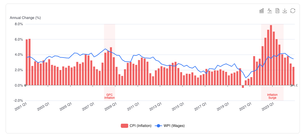
The wages vs inflation story is one of the most discussed economic narratives in Australia. Are workers’ wages keeping pace with rising prices? A mixed bar and line chart on a single axis answers this clearly — bars for CPI change, a line for wage growth, the gap between them visible at a glance.

A second chart adds GDP volume on a dual Y axis — showing the relationship between economic output and price growth on the same canvas despite their different units and scales.

This module pulls together techniques from across the series: the DSL, formatters, palettes, markLine, markArea, and the ECharts toolbox.

By the end of this module you will have:

  • A mixed bar + line chart on a single Y axis
  • A dual Y axis chart with two different units
  • markArea highlighting periods where wages fell behind inflation
  • markLine at zero — the real wage growth reference line
  • ECharts toolbox with magicType, saveAsImage, and dataView

mixed_chart.png

11.1 — The Data Story

The WPI (Wage Price Index) and CPI (Consumer Price Index) are both quarterly index series from 2000–2024. Plotting the raw index values is less useful than plotting the year-on-year percentage change — that shows whether wages are rising faster or slower than prices in any given quarter.

The service computes percentage change from the index values:

pct_change = ((current - previous_year) / previous_year) * 100

Where previous_year is the reading four quarters prior — the same quarter in the previous year.


11.2 — The Service

 1
 2
 3
 4
 5
 6
 7
 8
 9
10
11
12
13
14
15
16
17
18
19
20
21
22
23
24
25
26
27
28
29
30
31
32
33
34
35
36
37
38
39
40
41
42
43
44
45
46
47
48
49
50
51
52
53
54
55
56
57
58
59
60
61
62
63
64
# app/services/stats/wages_vs_inflation.rb
module Stats
  module WagesVsInflation
    extend self

    # Returns quarterly year-on-year percentage changes for WPI and CPI,
    # aligned on shared periods from 2001 Q1 (first year with a prior year).
    #
    # {
    #   periods: ["2001 Q1", "2001 Q2", ...],
    #   wpi:     [3.2, 3.1, ...],    # % change year-on-year
    #   cpi:     [2.8, 3.0, ...],    # % change year-on-year
    #   gdp:     [351.9, 355.3, ...] # chain volume, billions
    # }
    def call
      wpi = pct_change(
        WagePriceReading
          .where(industry: "All Industries")
          .order(:year, :quarter)
          .pluck(:year, :quarter, :index_value)
      )

      cpi = pct_change(
        CpiReading
          .where(category: "All groups CPI")
          .order(:year, :quarter)
          .pluck(:year, :quarter, :index_value)
      )

      gdp = GdpReading
        .group(:year, :quarter)
        .order(:year, :quarter)
        .sum(:value_billions)
        .map { |(year, quarter), total|
          [[year, quarter], total.to_f.round(1)]
        }.to_h

      periods = wpi.keys & cpi.keys & gdp.keys

      {
        periods: periods.map { |y, q| "#{y} Q#{q}" },
        wpi:     periods.map { |p| wpi[p] },
        cpi:     periods.map { |p| cpi[p] },
        gdp:     periods.map { |p| gdp[p] }
      }
    end

    private

    def pct_change(readings)
      # Group by [year, quarter] → value
      by_period = readings.each_with_object({}) do |(year, quarter, value), h|
        h[[year, quarter]] = value.to_f
      end

      # Compute year-on-year % change — requires 4 prior quarters
      by_period.each_with_object({}) do |((year, quarter), value), h|
        prior = by_period[[year - 1, quarter]]
        next unless prior && prior > 0
        h[[year, quarter]] = ((value - prior) / prior * 100).round(2)
      end
    end
  end
end

The pct_change private method is used for both WPI and CPI — same calculation, different input series. Extracting it avoids duplication and makes the call method readable.


11.3 — Chart 1: Wages vs Inflation (Single Axis)

CPI change as bars, WPI change as a line. Both in percentage points on the same Y axis — directly comparable because they share a unit.

 1
 2
 3
 4
 5
 6
 7
 8
 9
10
11
12
13
14
15
16
17
18
19
20
21
22
23
24
25
26
27
28
29
30
31
32
33
34
35
36
37
38
39
40
41
42
43
44
45
46
47
48
49
50
51
52
53
54
55
56
57
58
59
60
61
62
63
64
65
66
67
68
69
70
71
# app/views/components/charts/wages_vs_inflation.rb
module Components
  module Charts
    class WagesVsInflation < Components::Chart
      prop :data, _Any, default: -> { {} }

      private

      def chart_options
        ::Chart::Options.new(
          color:   %w[#ef4444 #3b82f6],
          toolbox: {
            feature: {
              magicType:   { type: ["bar", "line"] },
              dataView:    { readOnly: true },
              saveAsImage: {},
              restore: {}
            }
          },
          tooltip:  { trigger: "axis", formatter: "rate" },
          legend:   { bottom: 5 },
          x_axis:   {
            type:      "category",
            data:      @data[:periods],
            axisLabel: { interval: 7, rotate: 30 }
          },
          y_axis:   {
            type:      "value",
            name:      "Annual Change (%)",
            axisLabel: { formatter: "rate" }
          },
          grid:     { bottom: 60, left: 18, right: 8, containLabel: true },
          series: [
            ::Chart::Series::Bar.new(
              name:      "CPI (Inflation)",
              data:      @data[:cpi],
              itemStyle: { opacity: 0.8 },
              markLine:  {
                silent: true,
                data:   [{ yAxis: 0, name: "Zero" }],
                lineStyle: { type: "solid", color: "#999", width: 1 }
              },
              markArea: {
                silent:    true,
                itemStyle: { color: "rgba(239, 68, 68, 0.06)" },
                label:     { position: "insideBottom", color: "#ef4444",
                             fontSize: 10 },
                data:      inflation_periods
              }
            ),
            ::Chart::Series::Line.new(
              name:   "WPI (Wages)",
              data:   @data[:wpi],
              smooth: false,
              symbol: "none",
              lineStyle: { width: 2 }
            )
          ]
        )
      end

      # Periods where CPI consistently exceeded WPI — wages falling behind
      def inflation_periods
        [
          [{ xAxis: "2021 Q3", name: "Inflation\nSurge" }, { xAxis: "2023 Q2" }],
          [{ xAxis: "2008 Q1", name: "GFC\nInflation" },   { xAxis: "2008 Q4" }]
        ]
      end
    end
  end
end

magicType: ["bar", "line"] — the toolbox lets the user toggle between bars and lines for CPI. Useful for comparing the shape of the series without changing the data.

dataView: { readOnly: true } — shows the raw data in a table. Useful for accessibility and for users who want to copy the values.

markLine at yAxis: 0 — a solid reference line at zero. Quarters where the bar extends below zero are quarters of falling prices (deflation) or falling wage growth.

markArea highlights the 2021–2023 inflation surge and the brief GFC inflation spike — periods where the gap between wages and prices was most acute.


11.4 — Chart 2: GDP and Inflation (Dual Axis)

GDP in billions (left axis, bar) and CPI change in percentage (right axis, line). Different units on the same chart — dual Y axes make the relationship visible without distorting either scale.

 1
 2
 3
 4
 5
 6
 7
 8
 9
10
11
12
13
14
15
16
17
18
19
20
21
22
23
24
25
26
27
28
29
30
31
32
33
34
35
36
37
38
39
40
41
42
43
44
45
46
47
48
49
50
51
52
53
54
55
56
57
58
59
60
61
62
63
64
65
66
67
# app/views/components/charts/gdp_vs_inflation.rb
module Components
  module Charts
    class GdpVsInflation < Components::Chart
      prop :data, _Any, default: -> { {} }

      private

      def chart_options
        ::Chart::Options.new(
          color:   %w[#3b82f6 #ef4444],
          toolbox: {
            feature: {
              magicType:   { type: ["bar", "line"] },
              dataView:    { readOnly: true },
              saveAsImage: {},
              restore: {}
            }
          },
          tooltip: {
            trigger: "axis",
            axisPointer: { type: "cross" }
          },
          legend:  { bottom: 5 },
          x_axis:  {
            type:      "category",
            data:      @data[:periods],
            axisLabel: { interval: 7, rotate: 30 }
          },
          # ── Dual Y axes ───────────────────────────────────────────────
          y_axis: [
            {
              type:      "value",
              name:      "GDP ($B)",
              position:  "left",
              axisLabel: { formatter: "billions" }
            },
            {
              type:      "value",
              name:      "CPI Change (%)",
              position:  "right",
              axisLabel: { formatter: "rate" },
              splitLine: { show: false }   # avoid double grid lines
            }
          ],
          grid:    { bottom: 60, left: 8, right: 60, containLabel: true },
          series: [
            ::Chart::Series::Bar.new(
              name:       "GDP",
              data:       @data[:gdp],
              yAxisIndex: 0,             # left axis
              itemStyle:  { opacity: 0.7 }
            ),
            ::Chart::Series::Line.new(
              name:       "CPI Change",
              data:       @data[:cpi],
              yAxisIndex: 1,             # right axis
              smooth:     false,
              symbol:     "none",
              lineStyle:  { width: 2, color: "#ef4444" }
            )
          ]
        )
      end
    end
  end
end

y_axis: as an array — when y_axis is an array, ECharts renders multiple Y axes. position: "left" and position: "right" place them on opposite sides.

yAxisIndex: on each series assigns it to the correct axis — 0 for the left, 1 for the right.

axisPointer: { type: "cross" } — the tooltip shows crosshair lines on both axes simultaneously, making it easy to read both values at the hovered position.

splitLine: { show: false } on the right axis — prevents double grid lines. Only the left axis should draw horizontal grid lines — otherwise the chart becomes cluttered.

grid: { right: 60 } — extra right margin to accommodate the right axis label.


11.5 — Controller and View

1
2
3
4
# app/controllers/charts_controller.rb
def wages_vs_inflation
  @data = Stats::WagesVsInflation.call
end
1
2
# config/routes.rb
get "charts/wages_vs_inflation", to: "charts#wages_vs_inflation"
<%# app/views/charts/wages_vs_inflation.html.erb %>
<div class="max-w-5xl mx-auto px-4 py-8">

  <h1 class="text-3xl font-bold mb-2">Wages vs Inflation</h1>
  <p class="text-neutral-500 text-sm mb-8">
    Quarterly year-on-year percentage change, 2001–2024.
    Source: ABS Wage Price Index (cat. 6345.0) and CPI (cat. 6401.0), CC BY 4.0.
  </p>

  <h2 class="text-xl font-semibold mb-2">Annual Change: Wages and Prices</h2>
  <p class="text-neutral-600 mb-4">
    CPI (inflation) as bars, WPI (wage growth) as a line. When the line sits
    below the bars, wages are growing more slowly than prices — real wages are
    falling. The shaded regions highlight the most acute periods.
    Use the toolbox to toggle between bar and line, or view the raw data.
  </p>
  <%= render Components::Charts::WagesVsInflation.new(
    data:   @data,
    height: "420px"
  ) %>

  <h2 class="text-xl font-semibold mt-10 mb-2">GDP and Inflation</h2>
  <p class="text-neutral-600 mb-4">
    GDP chain volume (bars, left axis) alongside CPI annual change (line,
    right axis). Two different units on one chart — the dual axis keeps both
    series readable without distorting either scale. The GFC contraction and
    the COVID recovery are visible in the GDP bars; the inflation surge of
    2021–2023 stands out in the CPI line.
  </p>
  <%= render Components::Charts::GdpVsInflation.new(
    data:   @data,
    height: "420px"
  ) %>

  <div class="border-t border-neutral-200 pt-6 mt-8">
    <p class="text-neutral-400 text-xs">
      Data: Australian Bureau of Statistics. CC BY 4.0.
      WPI: Wage Price Index, Australia (cat. 6345.0).
      CPI: Consumer Price Index, Australia (cat. 6401.0).
      GDP: Australian National Accounts (cat. 5206.0).
    </p>
  </div>

</div>

11.6 — Dual Axis Pitfalls

The dual axis is powerful but easily misused. A few rules worth knowing:

Only use a dual axis when the relationship matters. If the two series have no meaningful relationship, put them on separate charts. The dual axis implies a connection — GDP and inflation have one (growth affects prices); two unrelated series on a dual axis is misleading.

The right axis has no grid lines. Always set splitLine: { show: false } on the secondary axis. Two sets of horizontal grid lines at different scales creates visual noise and confusion.

Extra right margin. The right axis label needs space — grid: { right: 60 } prevents it overlapping the chart area.

axisPointer: { type: "cross" } is the right tooltip for dual axis charts. It shows the value on both axes simultaneously, which is exactly what the user needs when comparing two different scales.


11.7 — Gallery

<%= render "charts/gallery_card",
  title:       "Wages vs Inflation",
  description: "Mixed bar and line chart with markLine and markArea. "\
               "Dual Y axis showing GDP and CPI on the same canvas.",
  path:        charts_wages_vs_inflation_path %>

11.8 — Module Summary

New files:

File Purpose
app/services/stats/wages_vs_inflation.rb YoY % change for WPI, CPI + GDP totals
app/views/components/charts/wages_vs_inflation.rb Mixed bar + line, single axis
app/views/components/charts/gdp_vs_inflation.rb Bar + line, dual Y axis

Patterns introduced:

  • Mixed series — Chart::Series::Bar and Chart::Series::Line in the same chart
  • Dual Y axis — y_axis: as an array, position:, yAxisIndex:
  • axisPointer: { type: "cross" } — dual axis tooltip
  • splitLine: { show: false } on secondary axis — prevents double grid lines
  • Year-on-year percentage change computed from index values
  • dataView: { readOnly: true } — raw data table in toolbox
  • magicType: ["bar", "line"] — series type toggle in toolbox

Dual Y axis quick reference:

 1
 2
 3
 4
 5
 6
 7
 8
 9
10
# Two axes
y_axis: [
  { type: "value", position: "left",  name: "Left Label"  },
  { type: "value", position: "right", name: "Right Label",
    splitLine: { show: false } }
],

# Assign series to axes
::Chart::Series::Bar.new(name: "A", data: [...], yAxisIndex: 0)
::Chart::Series::Line.new(name: "B", data: [...], yAxisIndex: 1)