Module 03 — Bar and Stacked Bar: Labour Force by State
What We’re Building
The Labour Force dataset gives us monthly employment figures across 8 Australian states from 2012–2024. It is richer than the GDP data — multiple metrics per record and a monthly cadence that requires bucketing before charting.
By the end of this module you will have:
- A service that buckets monthly data into annual averages
- A grouped bar chart showing employment by state
- A horizontal bar chart showing the latest year as a snapshot
- An unemployment rate line/bar chart — demonstrating one service feeding multiple chart types
Three charts, one service, three new component patterns.
Here’s what we’ll be building:
3.1 — Chart::Series::Bar
Module 01 introduced Chart::Series::Line. This module introduces
Chart::Series::Bar — the same pattern, different series type.
The equivalent raw JavaScript:
|
|
In Ruby:
|
|
Chart::Series::Bar adds type: "bar" automatically. Everything else — name:,
data:, stack:, itemStyle: — passes through unchanged.
Stacking is one option away. Add stack: with a shared name and ECharts
stacks all series with the same value:
|
|
Both bars share stack: "total" — ECharts stacks them. The ECharts toolbox
magicType with "stack" toggles this on and off interactively. More on
the toolbox in section 3.3.
3.2 — The Service
The labour_force_readings table has 1,248 records — one per state per month.
Charting monthly data produces an illegible chart. The service buckets monthly
readings into annual averages:
|
|
Two things worth noting:
r.send(attr) — calling a method by name. When attr is :employed_thousands,
r.send(:employed_thousands) is equivalent to r.employed_thousands. This
avoids writing four separate average calculations for four metrics — one avg
helper handles all of them.
.reject(&:zero?) — zeros are excluded from averages. A missing month is stored
as zero; including it would drag the annual average down incorrectly.
The service returns the same data structure regardless of which chart type will consume it. The controller calls it once per action and passes the result to the component.
3.3 — The Grouped Bar Chart
|
|
The toolbox
The toolbox: option adds a row of icons to the top-right of the chart. All
interactions are handled natively by ECharts — no JavaScript needed:
|
|
| Feature | What it does |
|---|---|
magicType: ["bar", "line"] |
Toggles between bar and line series |
magicType: ["stack"] |
Adds a stack/unstack toggle |
saveAsImage |
Downloads the chart as a PNG |
restore |
Resets the chart to its original configuration |
restore is important when magicType is present — without it the user has
no way to return to the original chart type after toggling. Include them together.
Only include the features relevant to each chart. A pie chart has no use for
magicType: ["bar", "line"].
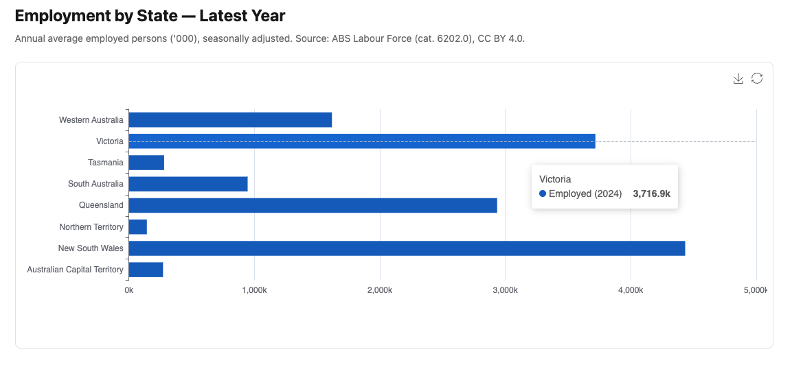
3.4 — The Horizontal Bar Chart
Horizontal bars suit state comparisons where category labels read more naturally on the Y axis. In ECharts, horizontal orientation is achieved by swapping the axis types:
|
|
That is the only change. ECharts infers orientation from the axis types.
|
|
@data.transform_values(&:last) — the service returns an array of annual records
per state. .last takes the most recent year’s record. The result is a hash of
{ state => latest_year_record } — one value per state, the current snapshot.
latest.values.first&.dig(:year) — extracts the year from the first state’s
latest record to use in the series name. &. (safe navigation) handles the
case where data is empty.
3.5 — The Unemployment Rate Chart
The same service, a different chart type. This is the principle: services transform data, components visualise it. The service doesn’t know or care what chart will consume it.
|
|
The "warm" palette — reds, oranges, and yellows — reinforces the “heat” of
unemployment data. The formatter "rate" displays values as percentages with
one decimal place. Both were introduced in Module 02.
The COVID-19 spike in 2020 is visible across all states. Tasmania and South Australia consistently track above the national average.
3.6 — The Plumbing
Three controller actions, three routes, three views. The pattern is identical to Module 01 — the controller calls the service, passes data to the view, the view renders the component.
|
|
|
|
<%# app/views/charts/labour_force.html.erb %>
<h1 class="text-2xl font-bold mb-2">Labour Force by State</h1>
<p class="text-neutral-500 text-sm mb-6">
  Annual average employed persons ('000), seasonally adjusted.
  Source: ABS Labour Force (cat. 6202.0), CC BY 4.0.
</p>
<%= render Components::Charts::LabourForce.new(data: @data) %>
<%# app/views/charts/labour_force_horizontal.html.erb %>
<h1 class="text-2xl font-bold mb-2">Employment by State — Latest Year</h1>
<p class="text-neutral-500 text-sm mb-6">
Annual average employed persons ('000), seasonally adjusted.
Source: ABS Labour Force (cat. 6202.0), CC BY 4.0.
</p>
<%= render Components::Charts::LabourForceHorizontal.new(data: @data) %><%# app/views/charts/unemployment_rate.html.erb %>
<h1 class="text-2xl font-bold mb-2">Unemployment Rate by State</h1>
<p class="text-neutral-500 text-sm mb-6">
Annual average unemployment rate (%), seasonally adjusted.
Source: ABS Labour Force (cat. 6202.0), CC BY 4.0.
</p>
<%= render Components::Charts::UnemploymentRate.new(data: @data) %>Gallery cards:
<%= render "charts/gallery_card",
  title:       "Labour Force by State",
  description: "Annual average employment by state, 2012–2024. "\
               "Toggle stacked/grouped or switch to line chart.",
  path:        charts_labour_force_path %>

<%= render "charts/gallery_card",
  title:       "Employment Snapshot",
  description: "Latest year employment by state — horizontal bar.",
  path:        charts_labour_force_horizontal_path %>

<%= render "charts/gallery_card",
  title:       "Unemployment Rate by State",
  description: "Annual average unemployment rate by state, 2012–2024.",
  path:        charts_unemployment_rate_path %>
3.7 — Module Summary
New files:
| File | Purpose |
|---|---|
app/services/stats/labour_force.rb |
Annual averages per state from monthly data |
app/views/components/charts/labour_force.rb |
Grouped bar chart with toolbox |
app/views/components/charts/labour_force_horizontal.rb |
Horizontal bar — latest year snapshot |
app/views/components/charts/unemployment_rate.rb |
Unemployment rate line chart |
Patterns introduced:
Chart::Series::Bar— same pattern asLine, addstype: "bar"automaticallystack:— shared name stacks bars; ECharts toolboxmagicTypetoggles interactively- Horizontal bars — swap
x_axisandy_axistypes, ECharts infers orientation - ECharts toolbox —
magicType,saveAsImage,restore— no custom JavaScript r.send(attr)— dynamic method dispatch avoids repetition in theavghelper- Same service, multiple chart types — the service is chart-agnostic
Next: Module 04 — Scatter: Labour Market Analysis