Lesson 12 — Beyond the Series: Extending the Pattern
What We’ve Built
Eleven modules. Twelve chart types. One architectural pattern:
controller → service → data → component → chart_controller.js → EChartsEvery chart in this series follows it. Every chart you build after this series follows it too — regardless of the ECharts chart type.
This module surveys the ECharts chart types we haven’t covered, shows the interesting configuration options that make each one different, and provides complete downloadable components keyed to the datasets you already have. The routing, controller actions, views, and gallery cards follow the same patterns you’ve applied eleven times — you can wire them up yourself.
The templates for each of these additional charts is downloadable at chart patterns
12.1 — The Choropleth Map
The centrepiece of this module.
A choropleth colours geographic regions by data value — Australian states coloured by unemployment rate, participation rate, or employment volume. The result is immediately readable: which states are struggling, which are thriving, how the picture changes over time.
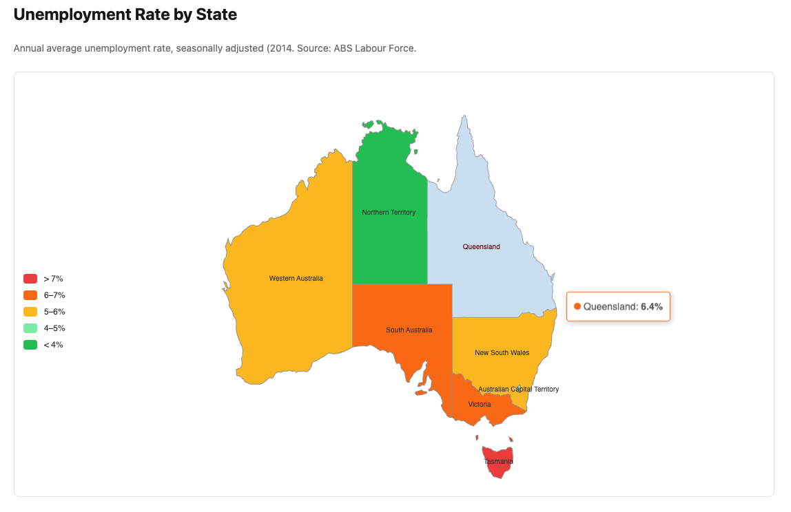
ECharts geo charts differ from every other chart type in one important way: they require a GeoJSON file registered with ECharts before any chart can render. This registration happens once, outside the component.
There’s some additional setup for this map chart because we’re loading this geojson
data to be able to show the underlying map. The component file has a comment section at
the top with the additional instructions.
The geo: option — defines the map coordinate system:
|
|
Dataset: LabourForceReading — unemployment rate or participation rate by
state. Stats::LabourForceSnapshot already returns the right shape — map the
state names to values.
12.2 — Treemap
Best for: Hierarchical composition — how a whole divides into parts, with sub-divisions within each part.
Natural dataset: GDP by industry — the 19 industries as top-level nodes, sized by value. Could be extended with sub-industry data if available.
What’s interesting:
|
|
levels: controls the visual appearance at each depth of the hierarchy. The
upperLabel shows the parent name when you drill into a node.
Dataset: GdpReading — value by industry, latest quarter.
12.3 — Sankey Diagram
Best for: Flows between categories — where value comes from and where it goes. Budget flows, energy flows, migration flows.
Natural dataset: Labour force flows — employed, unemployed, not in labour
force — could be constructed from LabourForceReading as a simplified flow
diagram.
What’s interesting:
|
|
emphasis: { focus: "adjacency" } highlights all connected nodes and links
when hovering — essential for readability in a complex Sankey.
lineStyle: { color: "source" } colours each flow line to match its source
node — makes the diagram much easier to follow.
12.4 — Radar Chart
Best for: Multi-dimensional comparison — how several entities score across the same set of dimensions.
Natural dataset: LabourForceReading — compare states across four metrics:
employment rate, participation rate, unemployment rate, employment volume
(normalised). Each state is a polygon on the radar.
What’s interesting:
|
|
indicator: defines the axes — each with a name and a max value for scaling.
All series are normalised against these maxima. Getting the max values right
is important — too high and the polygon collapses to the centre; too low and it
overflows.
Dataset: LabourForceReading + WagePriceReading — latest year averages
by state.
12.5 — Candlestick Chart
Best for: Financial OHLCV data — open, high, low, close price over time.
Natural dataset: StockFeed from Module 08 — generate OHLCV data instead
of just close prices. The broadcaster already produces tick data; accumulating
it into OHLCV candles is straightforward.
What’s interesting:
|
|
ECharts candlestick data order is [open, close, low, high] — note that low
and high come after close, which is counterintuitive. Getting this wrong
produces inverted wicks.
scale: true on the Y axis is essential — without it the candles are
compressed against the zero line.
Dataset: StockFeed — accumulate ticks into OHLCV candles in the
broadcaster or a dedicated service.
12.6 — ThemeRiver
Best for: How composition changes over time — the rise and fall of different categories within a flowing stream.
Natural dataset: BusinessIndicatorReading — industry sales composition
over time. The stream shows which industries are growing and which are
contracting relative to the whole.
What’s interesting:
|
|
ThemeRiver uses single_axis rather than x_axis/y_axis — a single
time axis at the bottom. Data format is [date_string, value, series_name]
— the three-element array is different from every other chart type.
emphasis: { focus: "series" } dims all other streams when hovering one —
essential for readability when streams overlap.
Dataset: BusinessIndicatorReading — quarterly sales by industry,
shaped as [date, value, industry] triples.
12.7 — Sunburst
Best for: Hierarchical part-to-whole — like a treemap but radial. Good for two or three levels of hierarchy.
Natural dataset: GdpReading — outer ring: industries, inner ring: groups
of industries (services, goods-producing, primary). The sunburst shows both
the top-level composition and the sub-composition simultaneously.
What’s interesting:
|
|
levels: controls the appearance of each ring independently — radius range,
label rotation, and position. emphasis: { focus: "ancestor" } highlights
the path from root to the hovered node.
Dataset: GdpReading — latest quarter, grouped into industry sectors.
12.8 — The Pattern Holds
Every chart in this module follows the same architecture:
|
|
The chart type changes. The chart_options content changes. The architecture
does not.
ECharts has over 20 chart types. You now have the architecture, the infrastructure, and the patterns to use all of them. The interesting question for each new chart type is always the same: what does the data need to look like, and what are the options unique to this chart type? Everything else is already in place.
12.9 — Downloads
| Component | Dataset | Chart type |
|---|---|---|
labour_force_map.rb + australia-map.js |
LabourForceReading |
Choropleth |
gdp_treemap.rb |
GdpReading |
Treemap |
industry_sankey.rb |
GdpReading |
Sankey |
state_radar.rb |
LabourForceReading |
Radar |
stock_candlestick.rb |
StockFeed |
Candlestick |
industry_theme_river.rb |
BusinessIndicatorReading |
ThemeRiver |
gdp_sunburst.rb |
GdpReading |
Sunburst |
Each download is a complete Components::Charts::* component. Wire it up
using the same pattern as every other module:
- Add a service if needed (or reuse an existing one)
- Add a controller action
- Add a route
- Create a view
- Add a gallery card
12.10 — Gallery
<%= render "charts/gallery_card",
  title:       "Beyond the Series",
  description: "Choropleth, treemap, Sankey, radar, candlestick, "\
               "ThemeRiver, and sunburst — the pattern extended.",
  path:        charts_beyond_path %>
This concludes the Data Visualisation with Phlex and ECharts series.
See the Appendices for the JavaScript infrastructure reference, the base component and DSL internals, and the complete chart template library.